DFG-Case-Study

DREAM FOUNDRY GAMES WEBSITE DESIGN

Dream Foundry Games is a Pittsburgh, Pa based independent video game & software development company. They began to expand their business model and needed a fresh, new website that reflects their branding and mission. Hired as 2D artist & UI Specialist, I was granted the opportunity to update their online presence.

ROLE:

UI Designer

FOCUS:

Visual Design & Layout (not UX focused)

TOOLS:

Figma, Photoshop, Illustrator, After Effects

DURATION:

3 Weeks

BACKGROUND

Dream Foundry Games is a child company to Digital Arc Systems, a small software development company who’s mission is to work with clients from the creative and science based communities to provide new tools and other mediums for client IP.

PROBLEM

The company had been looking to expand from science and tech based applications to creative and art related cliental and projects. They needed an update to their marketing and website to reflect the clients that they wished to work with. They wanted a website that was clean, but still gave users full transparency of their process, and the tools & tech they brought to every project. It was also important that they gave a friendly and fun visual to their users that reflected a “work is play” attitude.

GOALS

To create a responsive website that would appeal to artists and entrepreneurs with similar creative spirits looking to take their vision/IP to the exciting medium of video games and mobile applications. 

RESEARCH

OVERVIEW

  • RESEARCH APPROACH
  • CLIENT REVIEW
  • COMPETITIVE ANALYSIS

RESEARCH APPROACH

To best understand how Dream Foundry Games wished to market themselves, I utilized two main strategies — client review, and competitive analysis. The former would be a series of meetings to discuss the themes and layouts necessary to achieve the right content needed for the new website design. The latter was employed to thoroughly research other game development companies within Pittsburgh to see what type of cliental, content presented and branding was used.

CLIENT REVIEW

The initial reviews pre-research and designs were conducted to get a sense of what the client’s needs were: Content, feel & imagery that would all showcase not only the work that Dream Foundry Games implemented, but also would give visitors a great sense of “who” Dream Foundry Games is as a collective. They desired a website that gave transparency to the costs and process for projects, but wished to come across as friendly and genuine.

Client review would be a continuous process that would help to bring the website to its high-fidelity stages. This not only would involve the art and assets, but also the development of the finalized copy the client was involved in crafting.

CLIENT WEBSITE COPY

COMPETITIVE ANALYSIS

The initial reviews pre-research and designs were conducted to get a sense of what the client’s needs were: Content, feel & imagery that would all showcase not only the work that Dream Foundry Games implemented, but also would give visitors a great sense of “who” Dream Foundry Games is as a collective. They desired a website that gave transparency to the costs and process for projects, but wished to come across as friendly and genuine.

VISUAL EXPLORATION

OVERVIEW

  • COLOR PALETTE
  • TYPOGRAPHY
  • UI COMPONENTS

COLOR PALETTE

The Branding for the web design utilizes a mixture of warm and cool colors, conveying the night sky with the warmth and wonder of the stars that inhabit it. The orange and yellows provide a pleasant glow to the purples and deep blue that lend to the idea and name of the company: Creating out of dreams. This analogous palette is meant to feel whimsical and fun.

DFG - COLOR PALETTE

TYPOGRAPHY

The fonts that were employed needed to fit the branding for Dream Foundry Games, while being clean and readable. The client wished to stay away from serifs, and so two sans-serif fonts were chosen by myself: Rubik and Roboto. The former was implemented as the header styled fonts, and the latter was for paragraphs and hyperlinks. Both fonts have rounded edges, conforming to branding while retaining a modern and readable standard for web design.

UI COMPONENTS

UI components for the site include buttons, Icons, and forms. All three use various forms of visual ques which help to create a bridge between the client’s website and the users for ease of navigation and pleasing interactivity. I followed an 8px grid guide for the buttons, scaling for icon hovers, and color swaps for the buttons for quick recognition of interactive behavoirs.

ANIMATED COMPONENT SHOWCASE

HOMEPAGE - SERVICES ICONS

For icons that represent the services provided by Dream Foundry Games, I created custom icons with bold fill and minimal/thin negative space to create the details. I wanted the iconography to make a clear, clean impression on potential clients.

INTERFACE DESIGN

OVERVIEW

  • DEFINE SCREENS
  • WIREFRAMES
  • HIGH FIDELITY DESIGN

DEFINE SCREENS

In order to begin the design process it was crucial to have a breakdown of the screens necessary, and a short idea of what content those screens would focus on. This mapping helps for organization, saving time and so that the company and I were on the same page from the beginning to the end of the design process.

WIREFRAMES

For the wireframes, I began by referencing the above breakdown list, and drew out simple sketches on paper to get a quick visual. This helped when going in and creating the low-fidelity layouts, because it allowed me to start testing page flow and structure before getting too far into the weeds of the designs.

The wireframes followed suite, as they allowed for a second pass on the content hierarchy and structure (a refinement stage). The wireframes then allowed me to quickly test the flow of the website, and to showcase it the the Dream Foundry Games team for further input from them.

LAYOUT SKETCHES

INTERACTIVE WIREFRAMES

HIGH FIDELITY DESIGNS

After completing the wireframes, the team and I reviewed layout & composition, screens (for accuracy), flow & hierarchy of content, and how the flow of the site should work for prototyping.

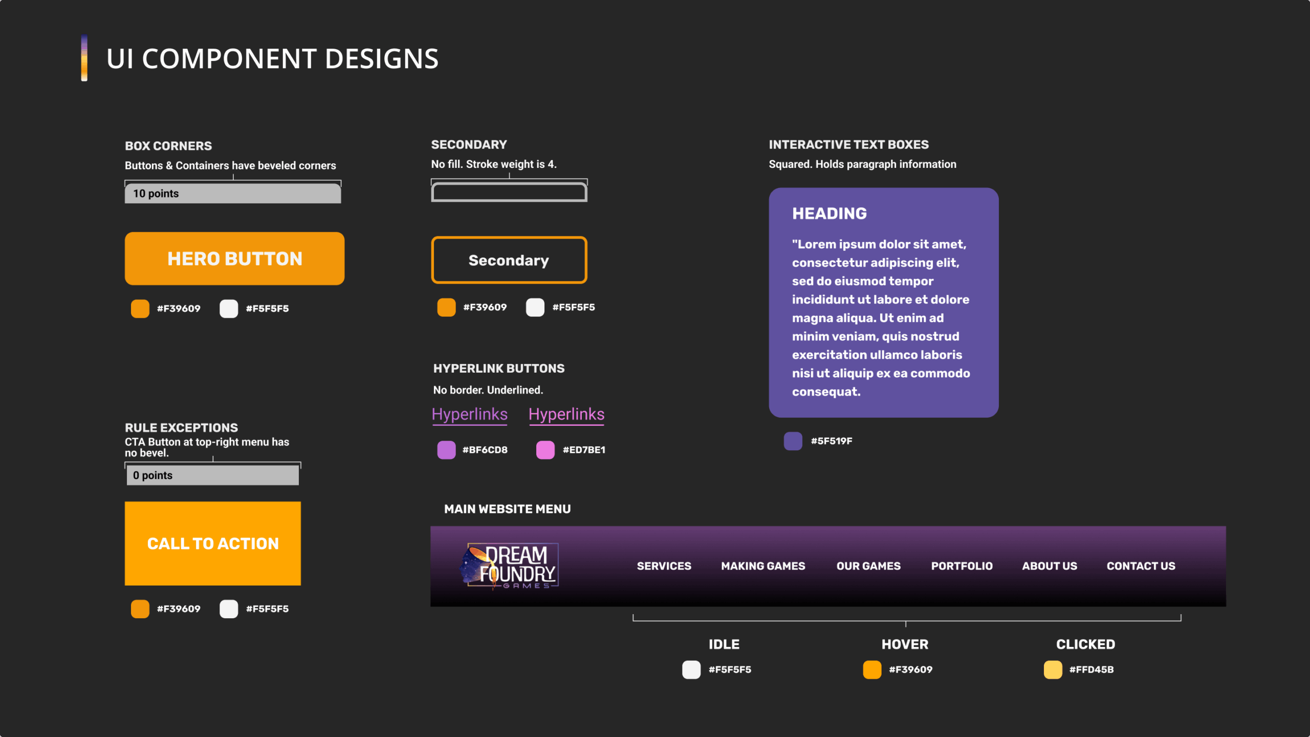
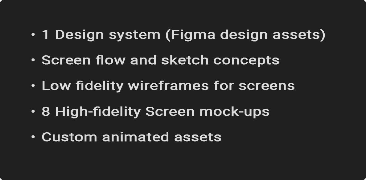
Once Dream Foundry Games was satisfied with the current state of the site, it was time to implement the design language, content mocks, and prototyping into the wireframes; giving them the high-fidelity quality and polished look of the website. This was done by copying the wireframes into a new Figma file, and beginning to replace the holder assets with the design language material, copy provided by the team, and mock assets (such as portfolio art, animations, and other visuals).

You can interact with the prototype here:

REFLECTION

This project taught me the value of creating a visual style and language based on pre-existing branding; retaining the colors and feeling of a logo & brand, while using new fonts and designs that fit the aesthetic of Dream Foundry Games. In future projects, I would like to have the opportunity to work more with icons, and explore more in terms of the mobile-first approach to design.

DELIVERABLES SUMMARY