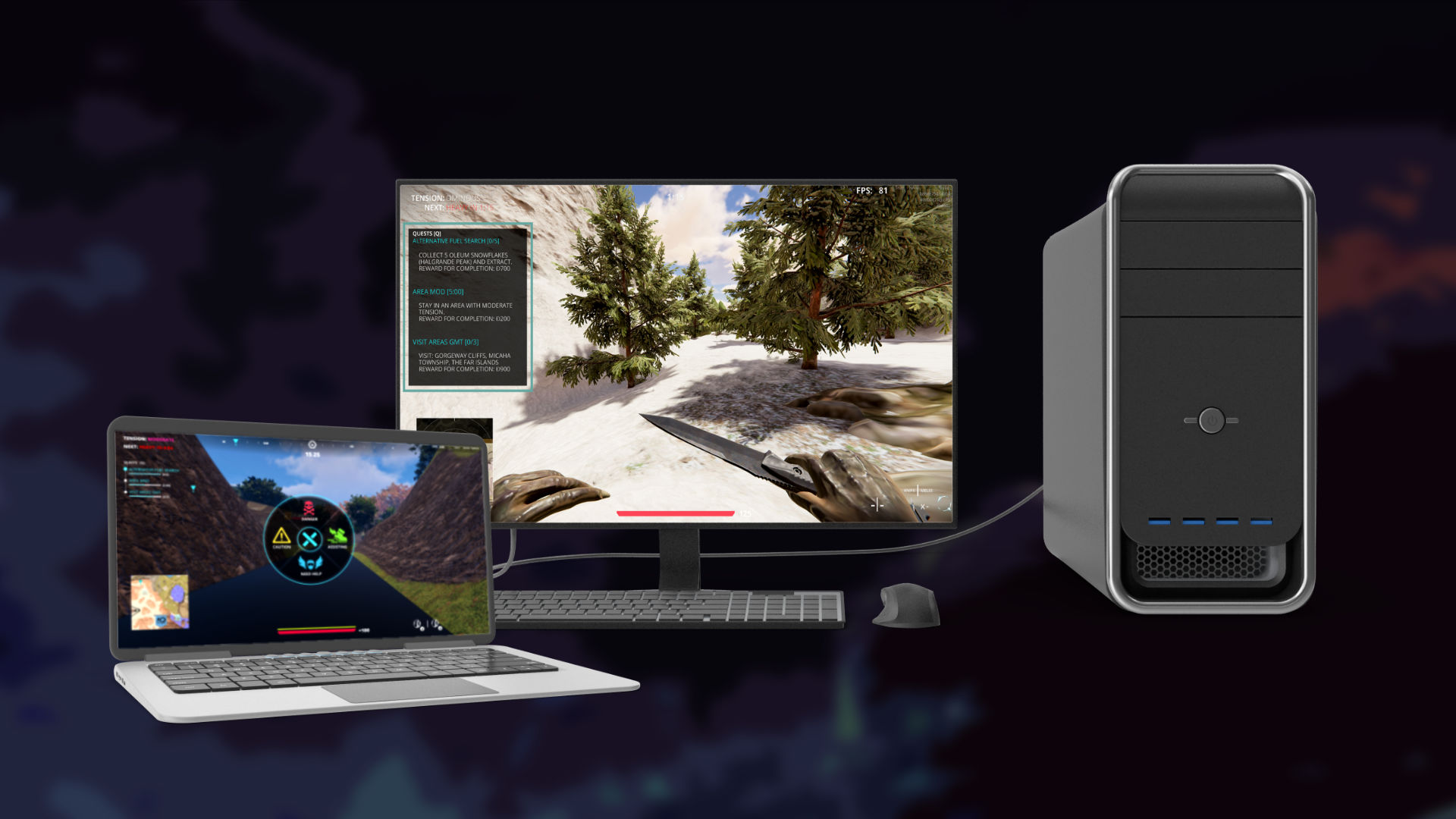
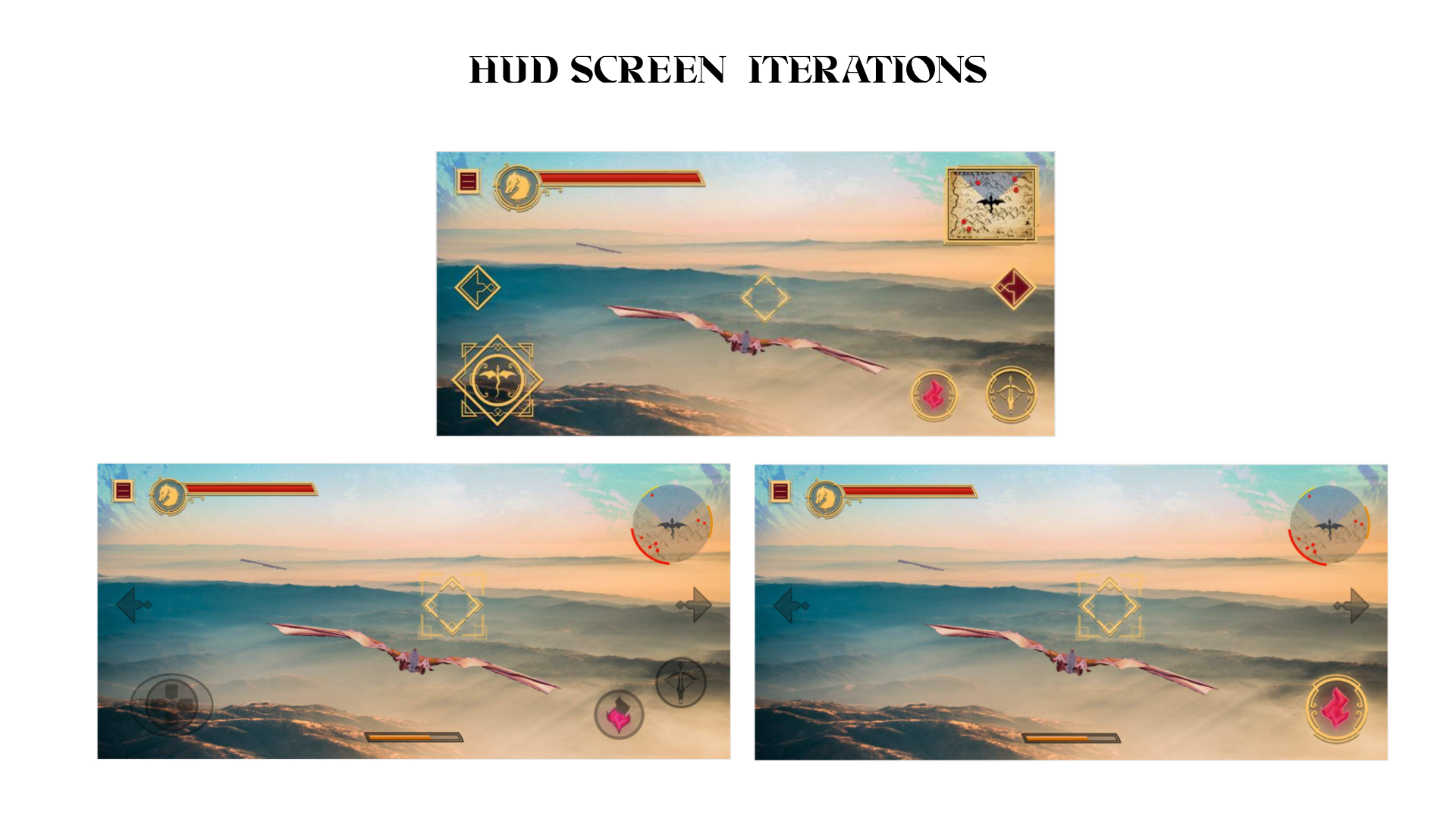
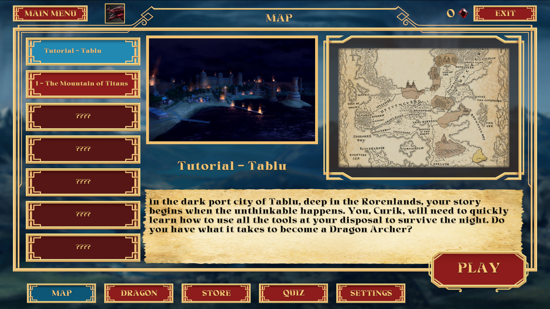
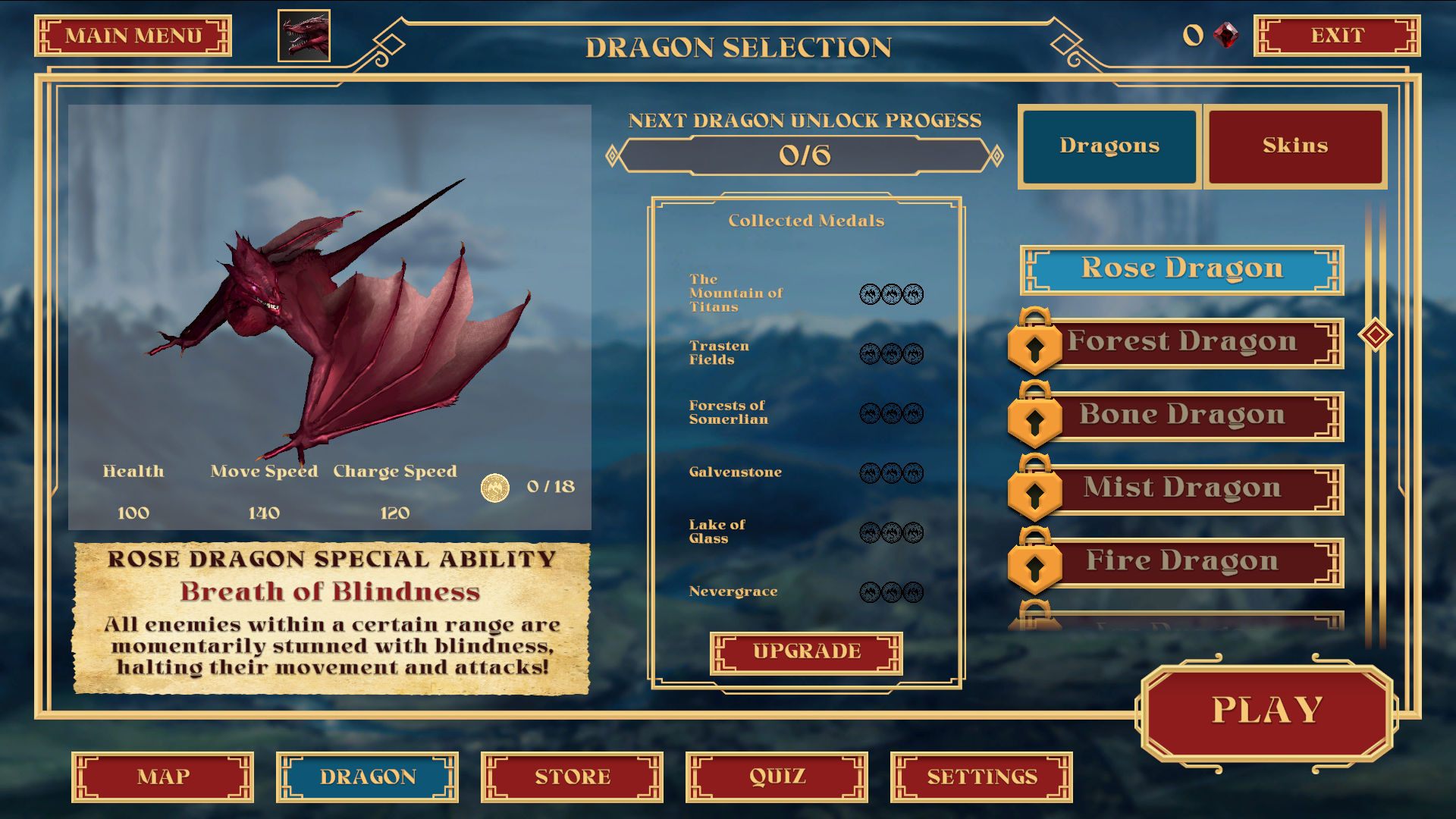
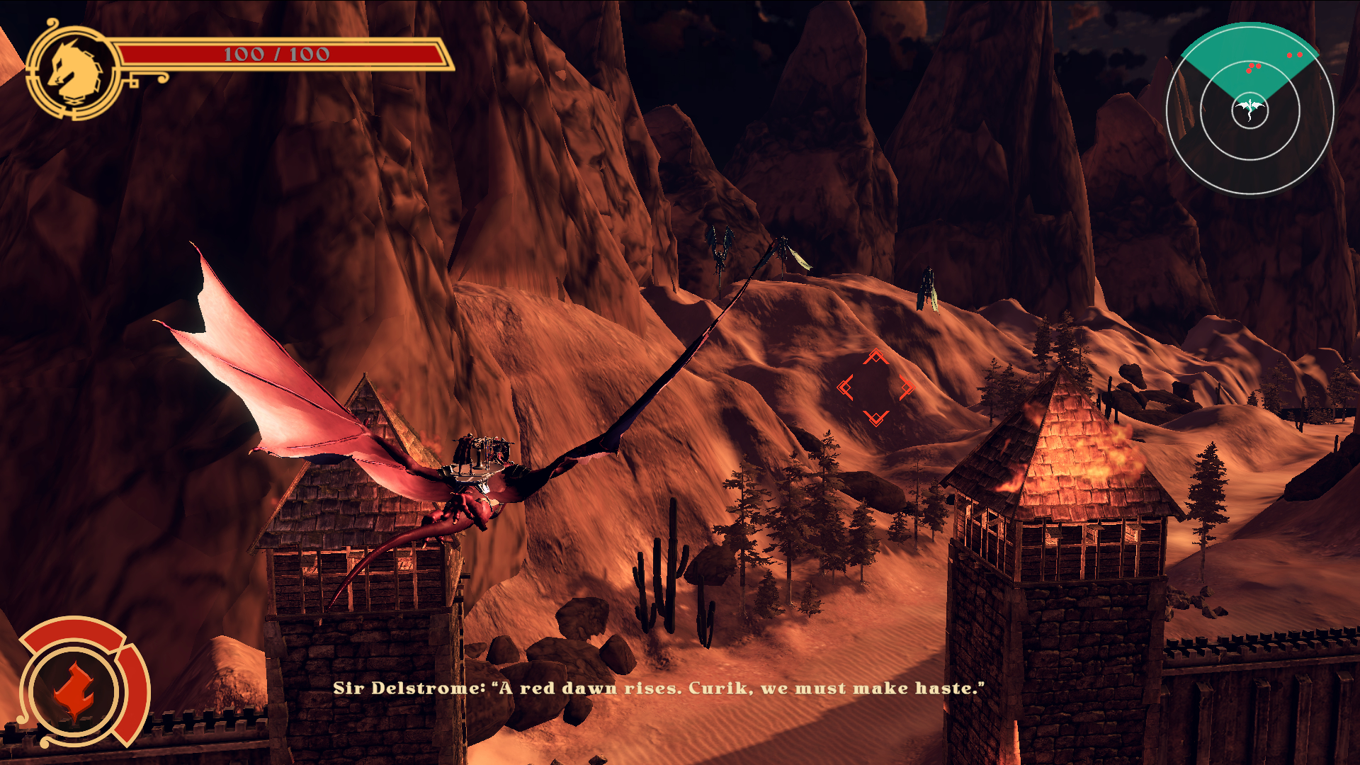
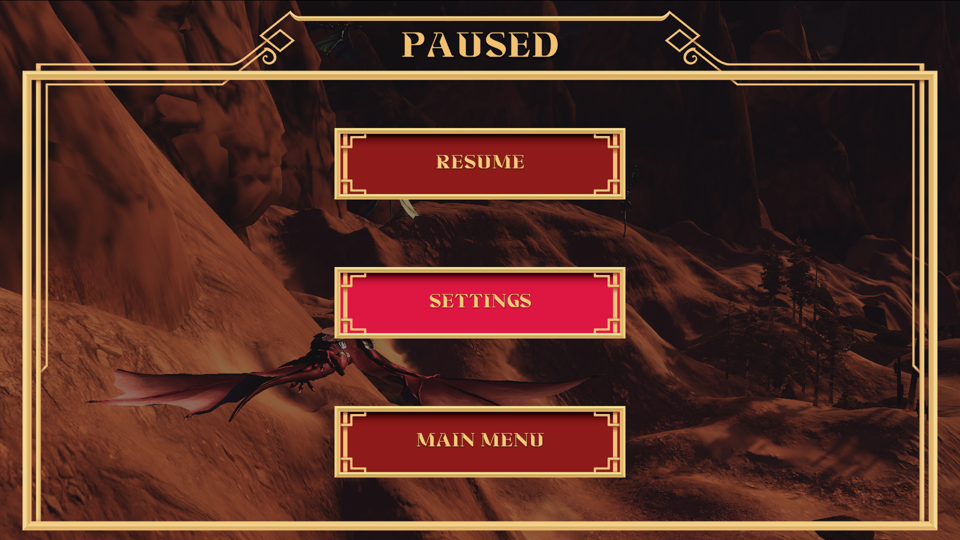
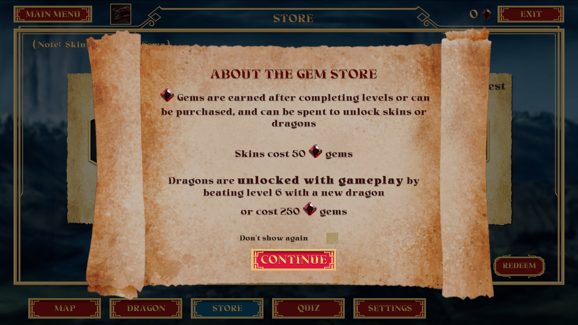
The UI for video games comes in multiple parts. There are menu designs necessary for the players to be able to navigate the various options that they may have prior, during and after interaction with the game world. Then, there is the game HUD (Heads Up Display) which is how the player interacts with the game world itself, during play. A third part that was not necessary for this project could be a website for the game, which is usually a marketing tool that can allow the users ability to reserve, purchase, and obtain news for the game.
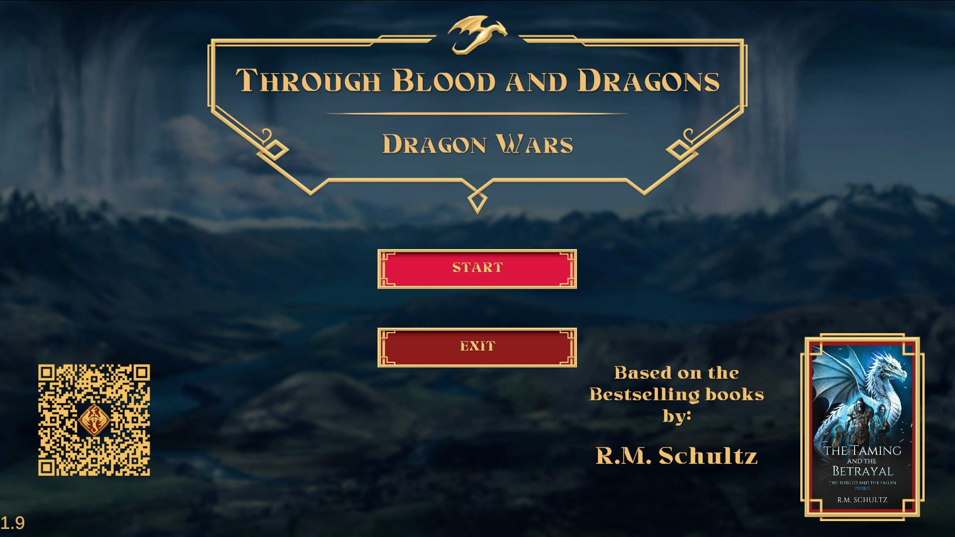
For Through Blood and Dragons, the client wanted to self-market, and use Steam as the main hub for platforming the title, and delivering information to players about developer updates, new content, and ability to purchase the game. (Note: As of this current case study, Through Blood and Dragons is slated to also release on XBox)
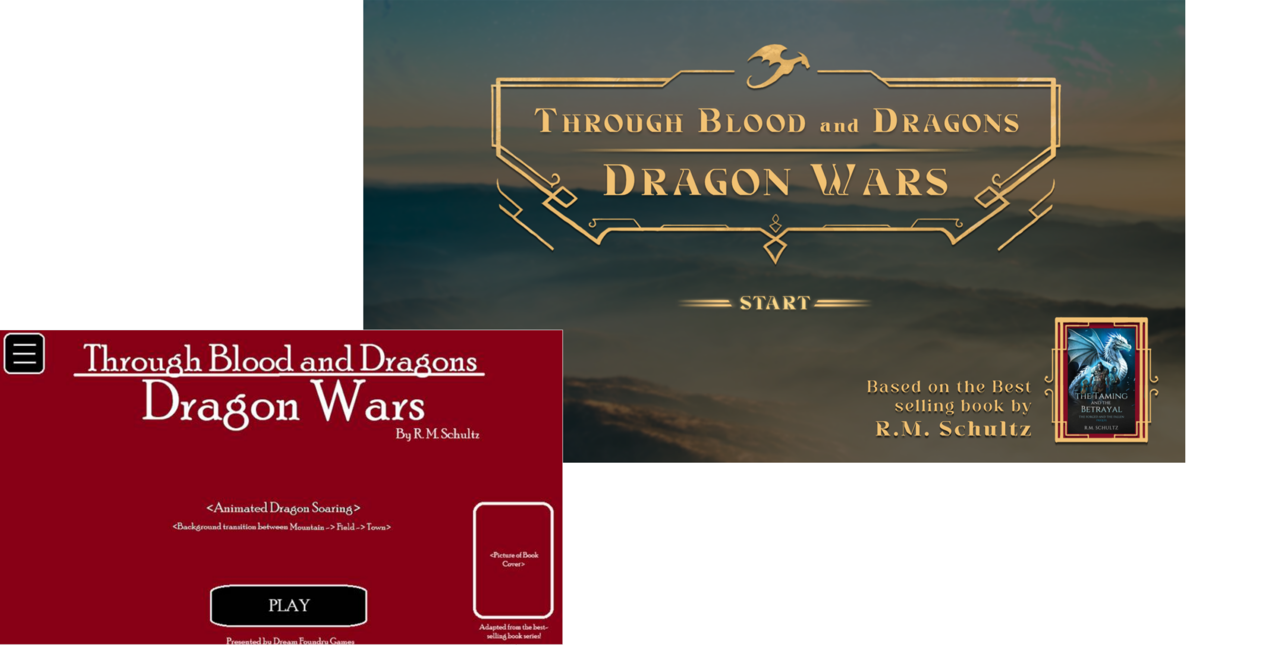
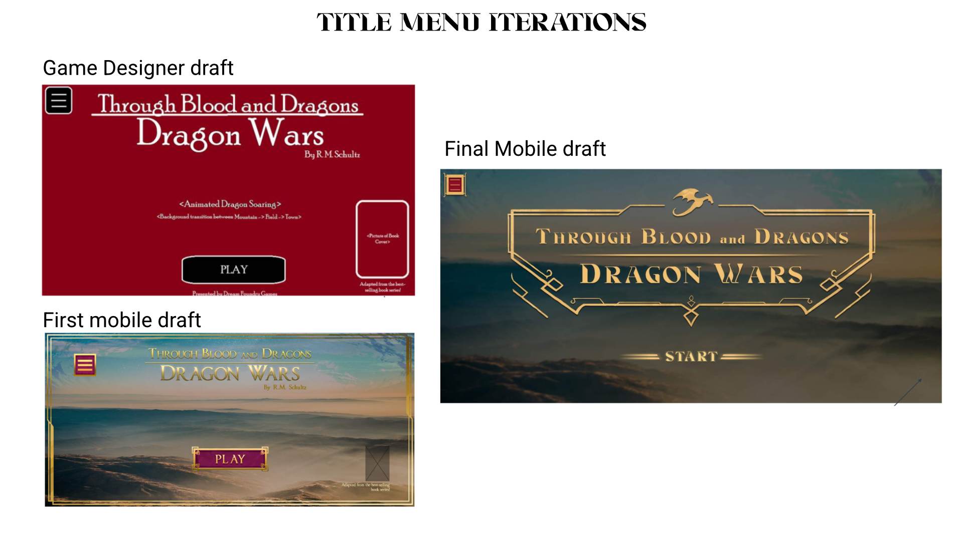
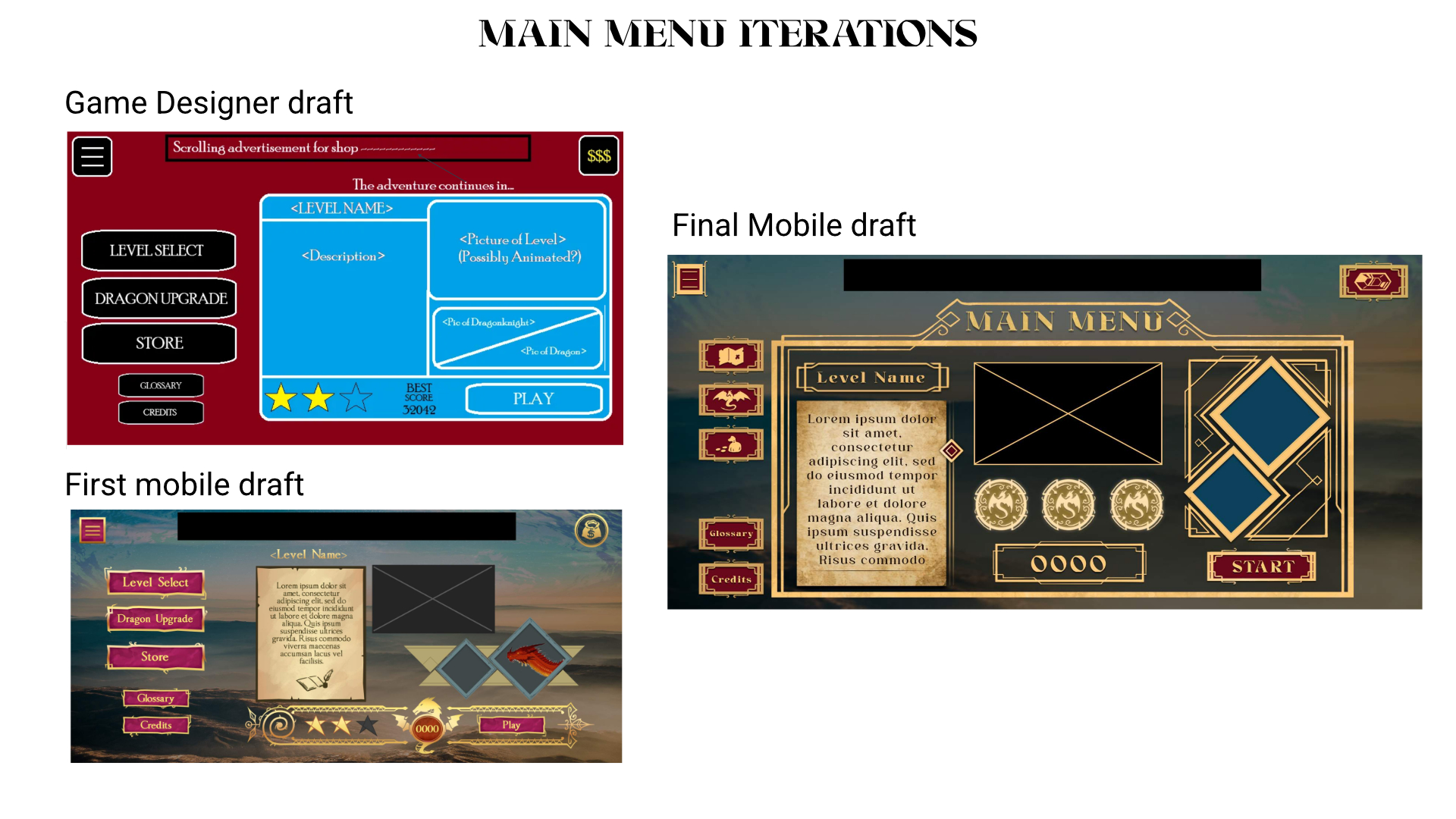
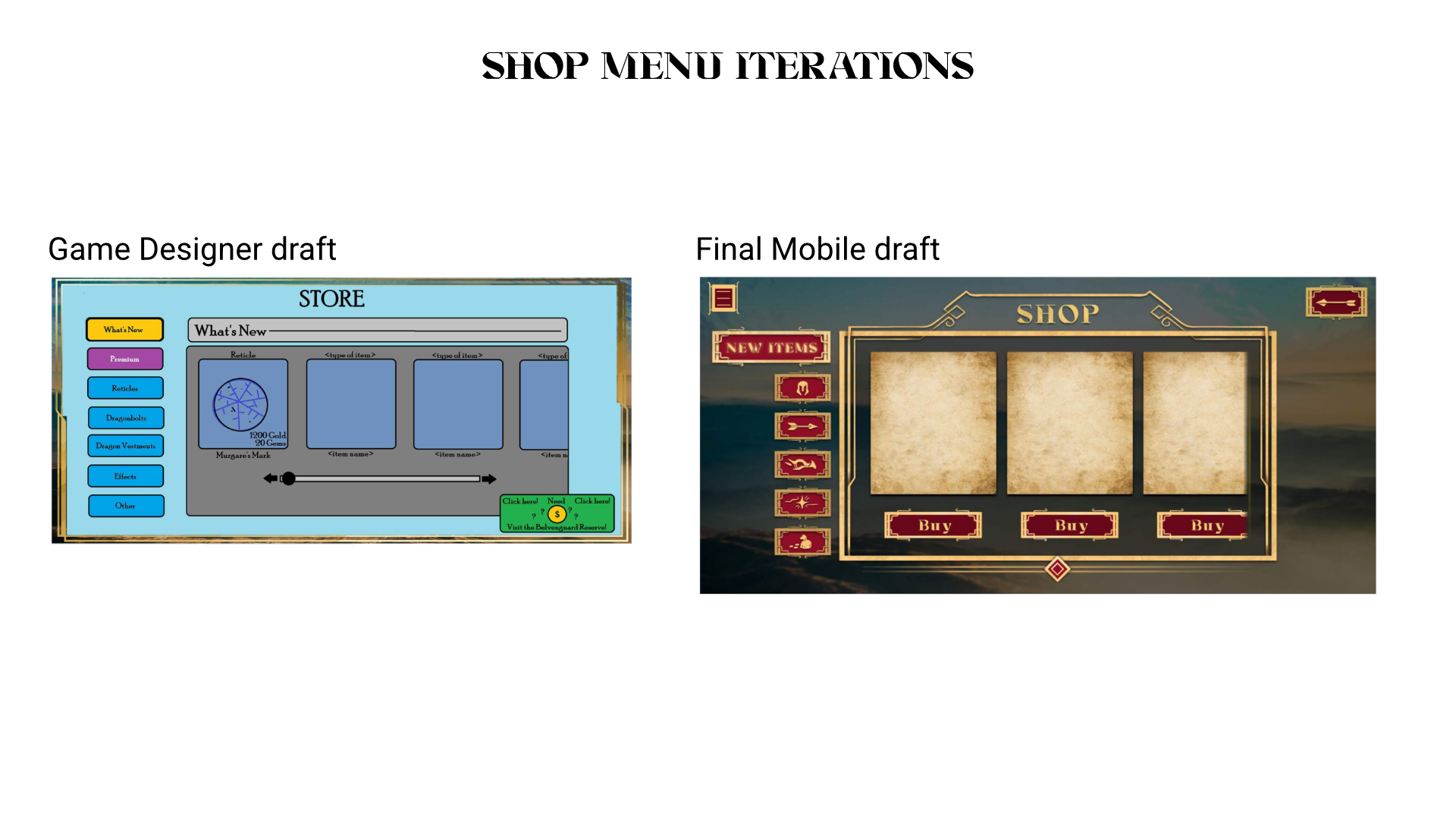
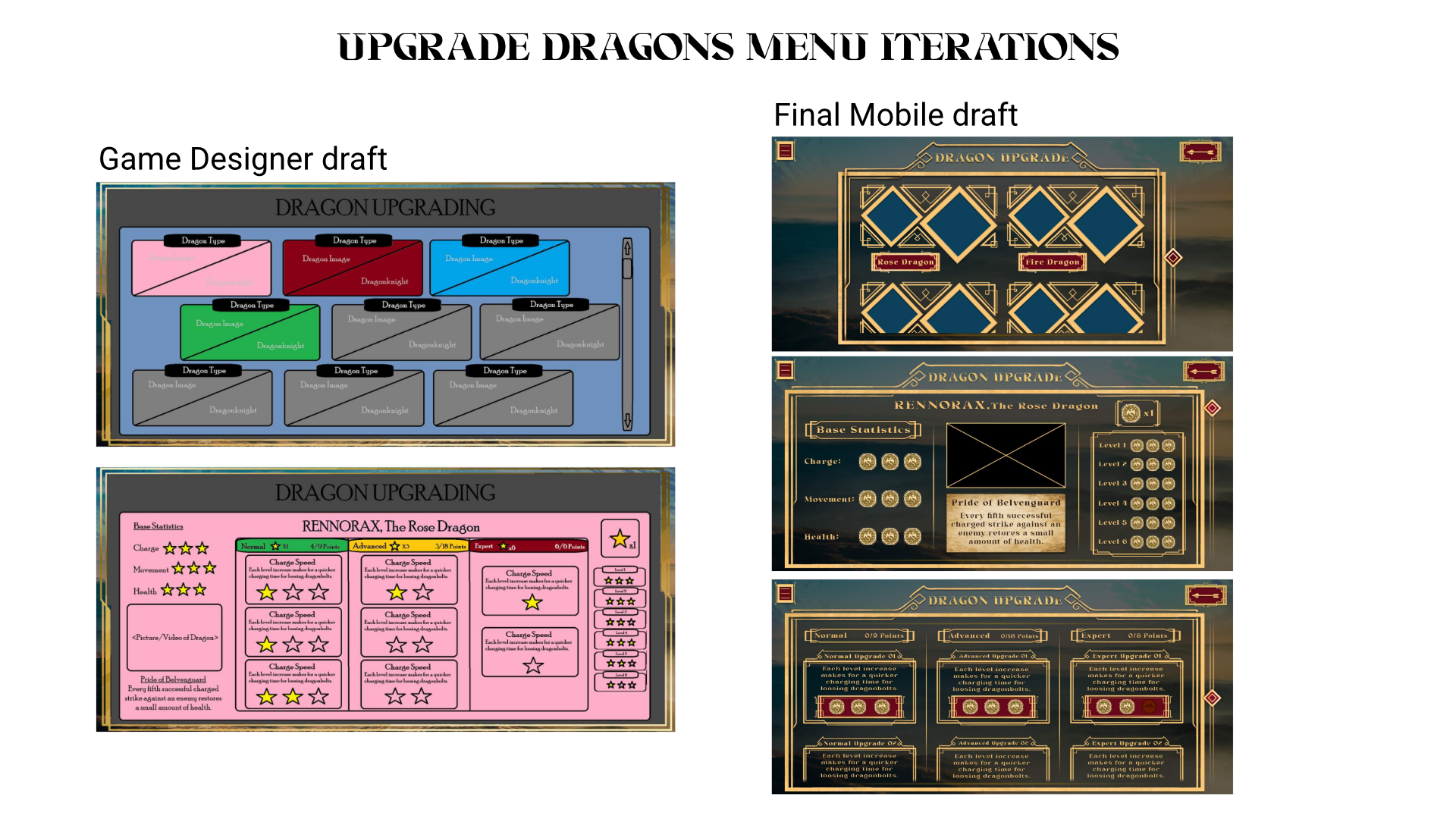
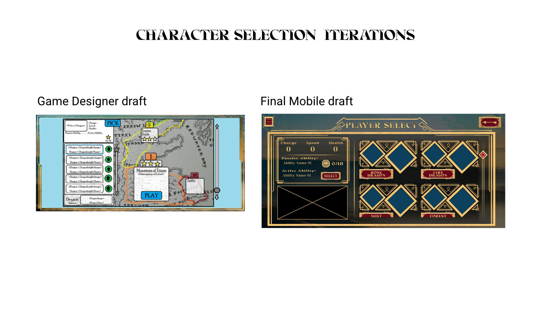
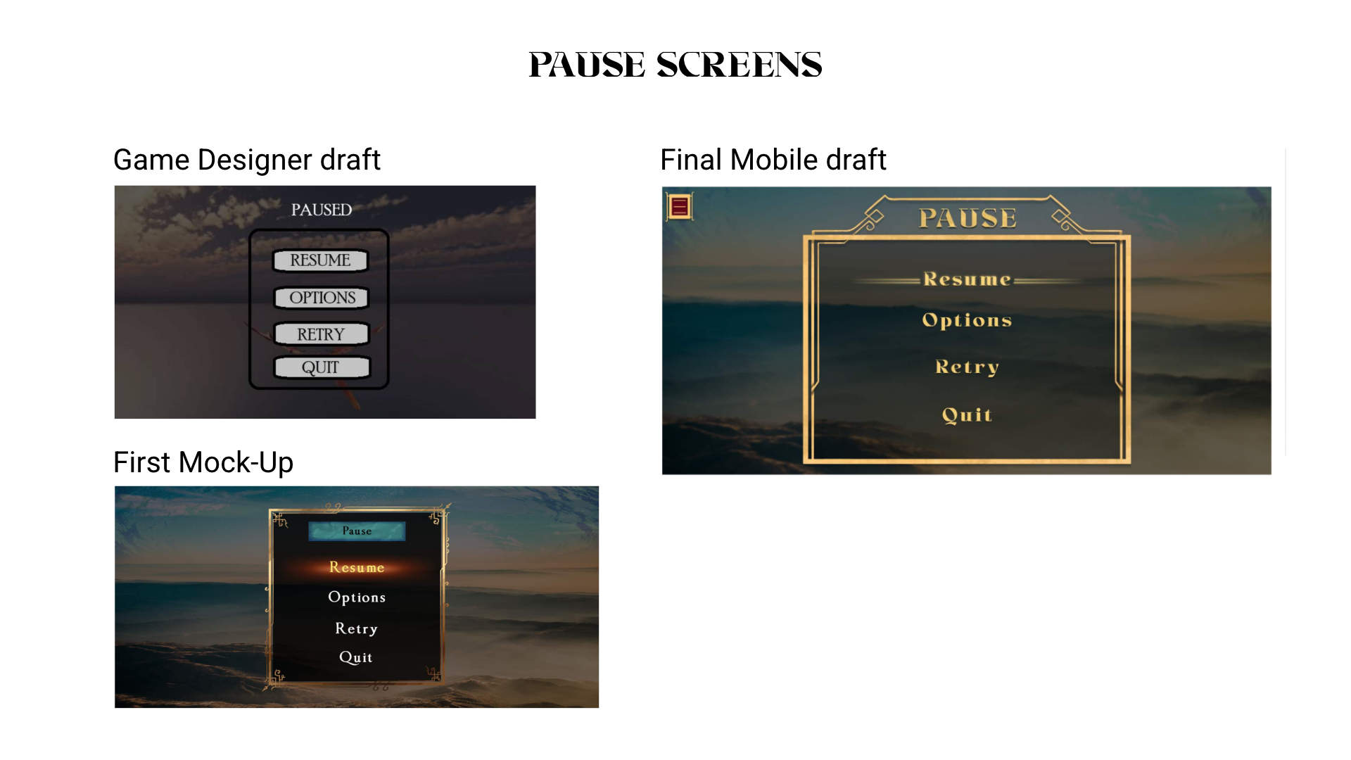
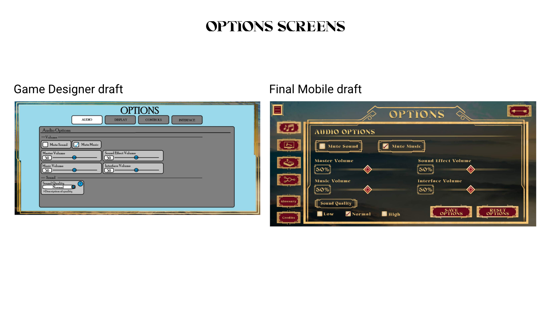
INITIAL MOCK-UPS (created by the game designer)
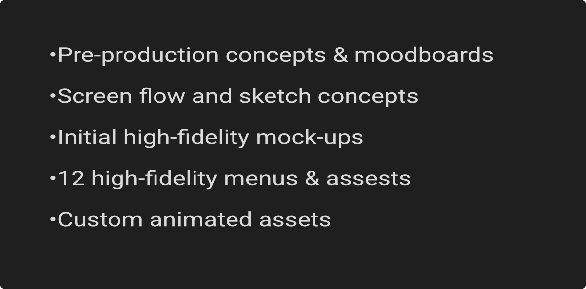
The initial mock-ups and layout were created by our game designer, Cameron Bowman. These were created as a mobile app layout at first, then reworked for platform gaming in mind.
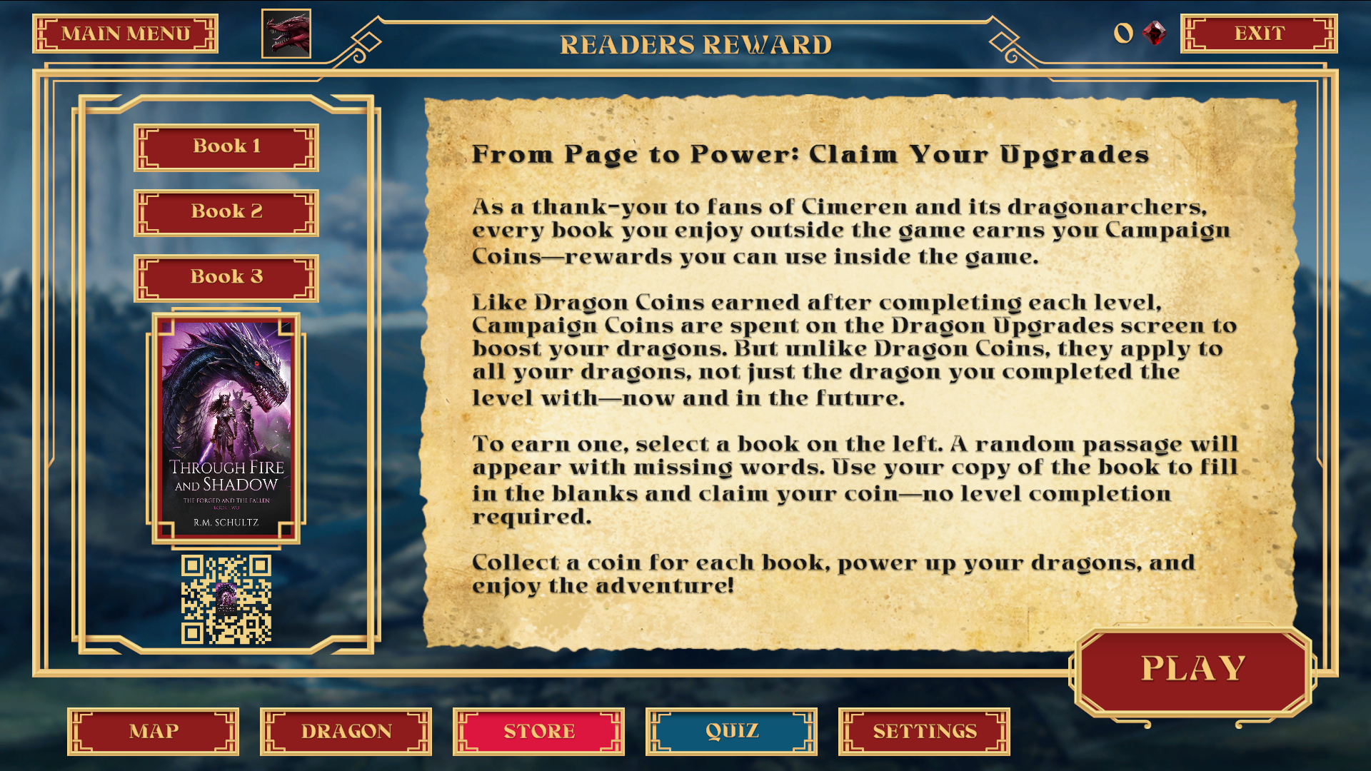
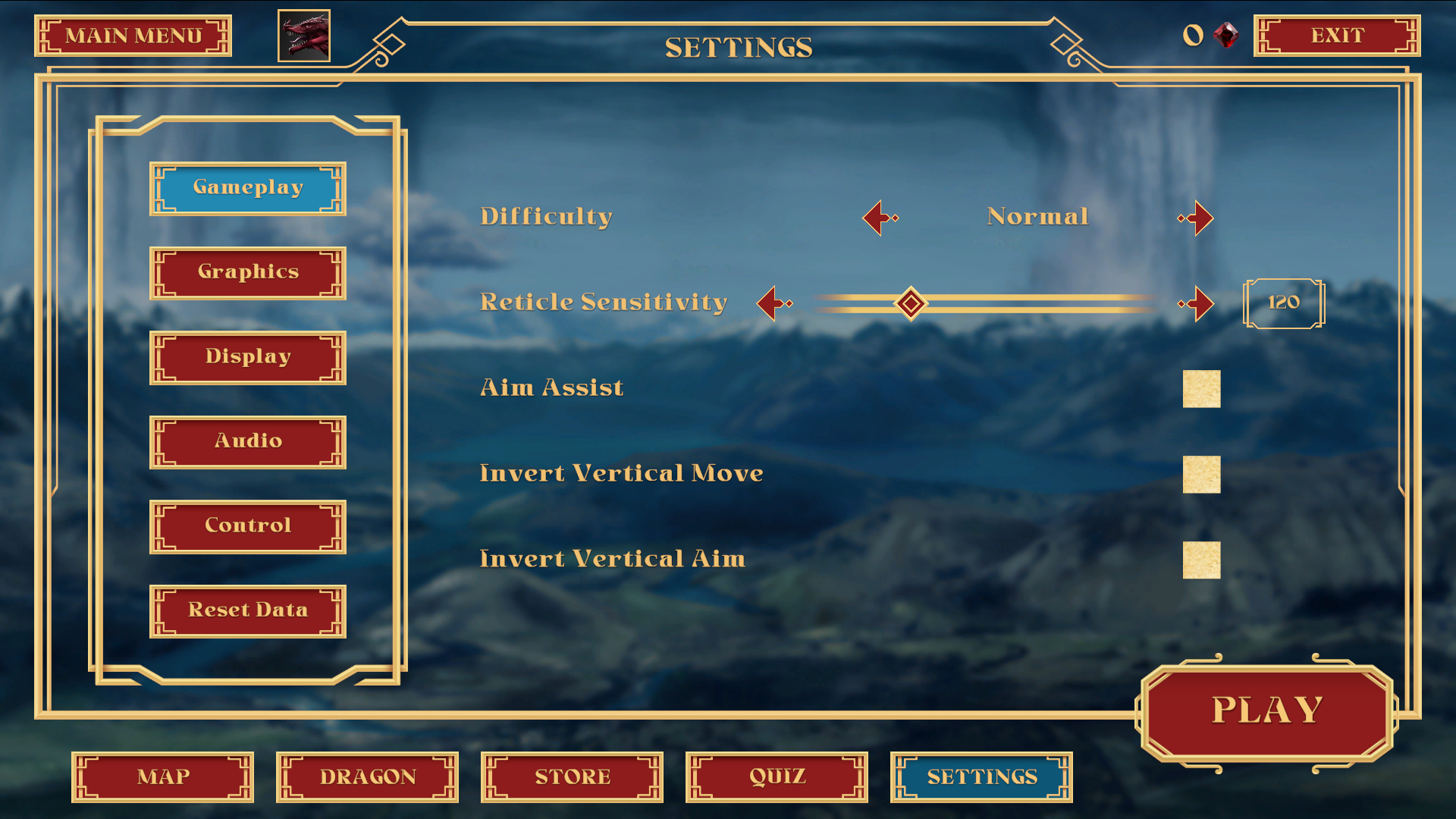
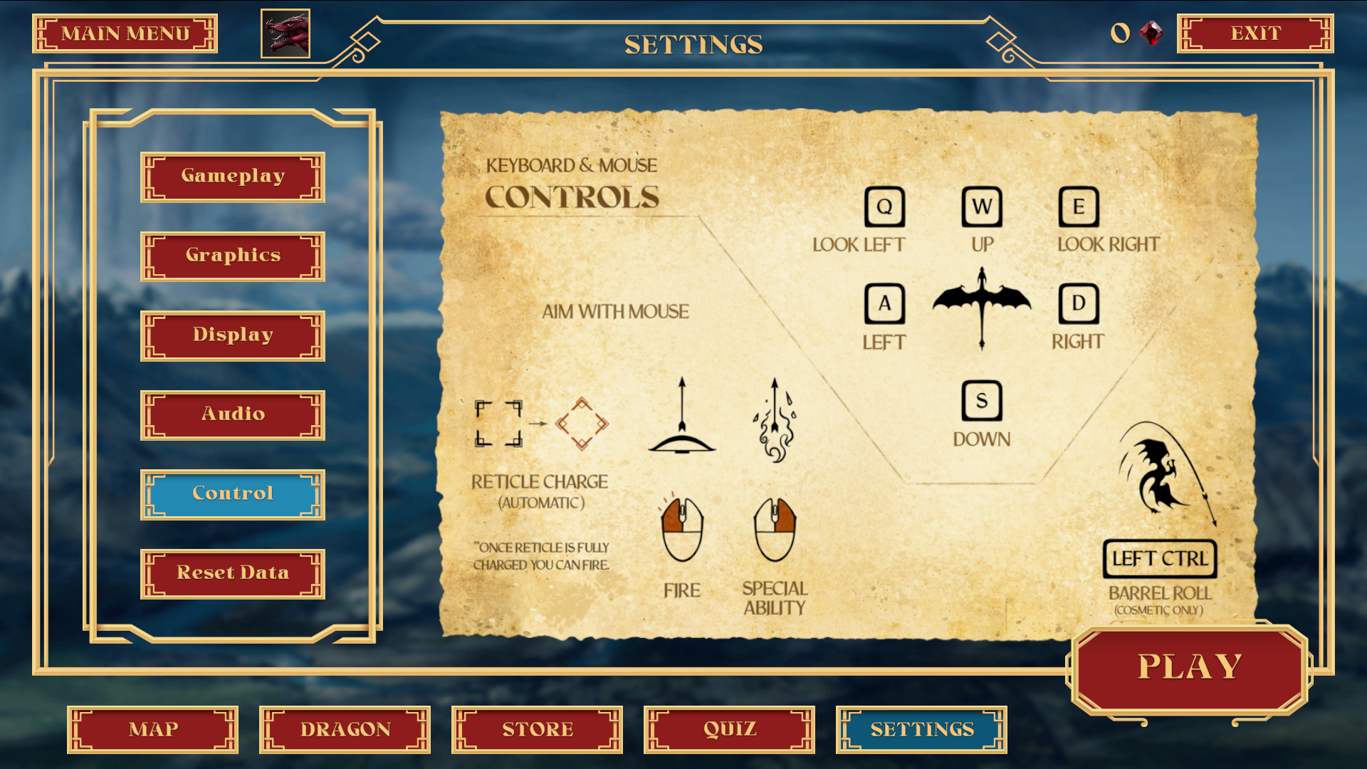
I worked with the game designer to revise these screens to work in a 16:9 aspect ratio (as the game would shift from a mobile to console game) to work with tv’s and and high resolution monitors. The changes in layout were minor, removing items such as a hamburger dropdown, and being able to make better use of the vertical axis for spacing.