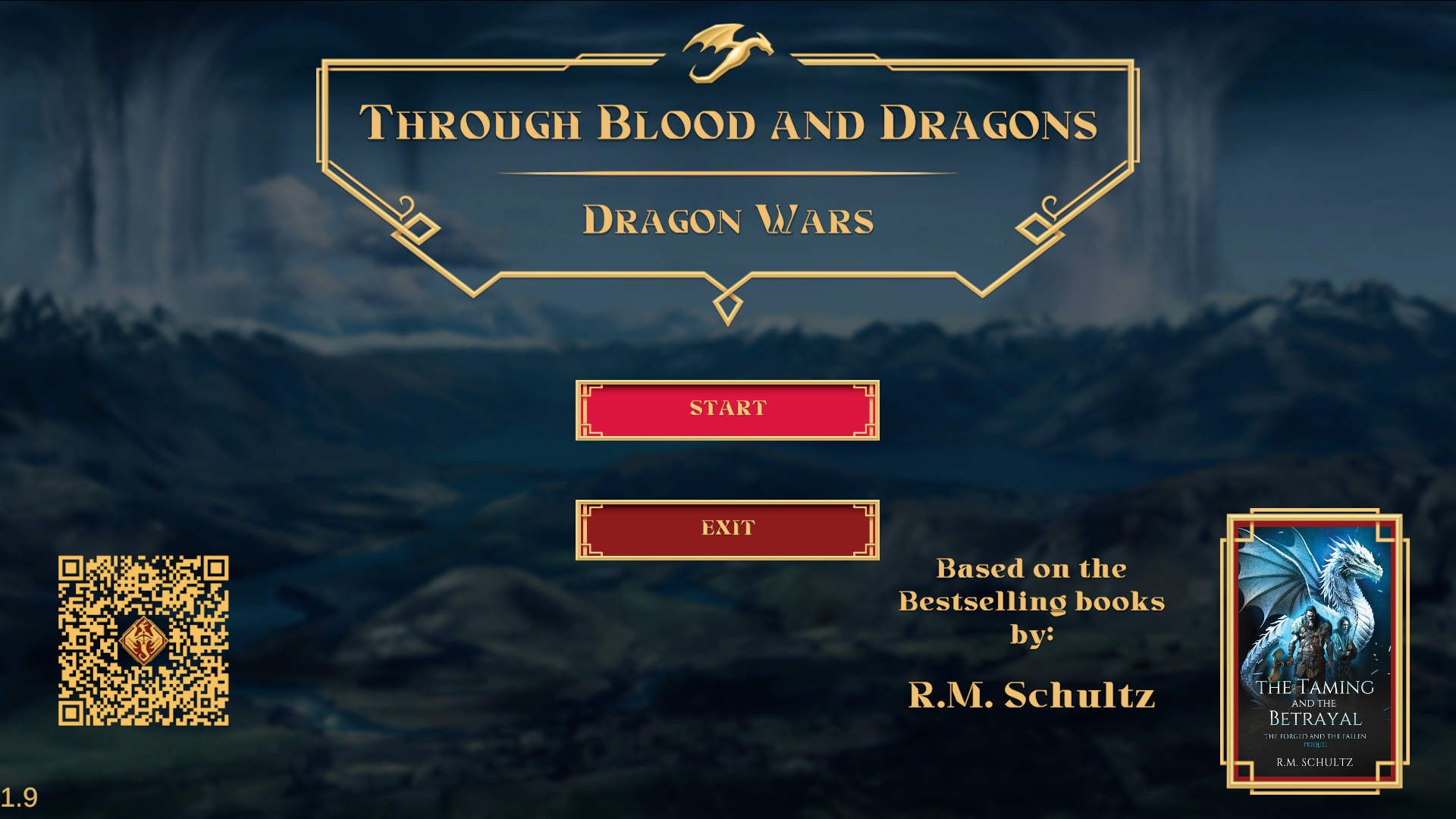
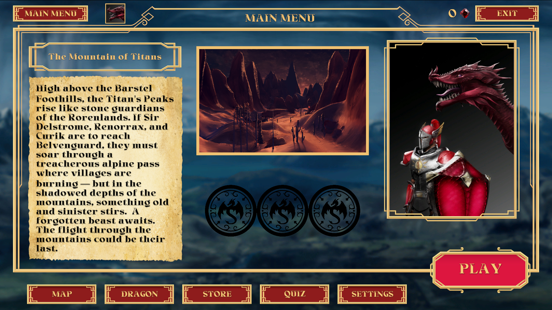
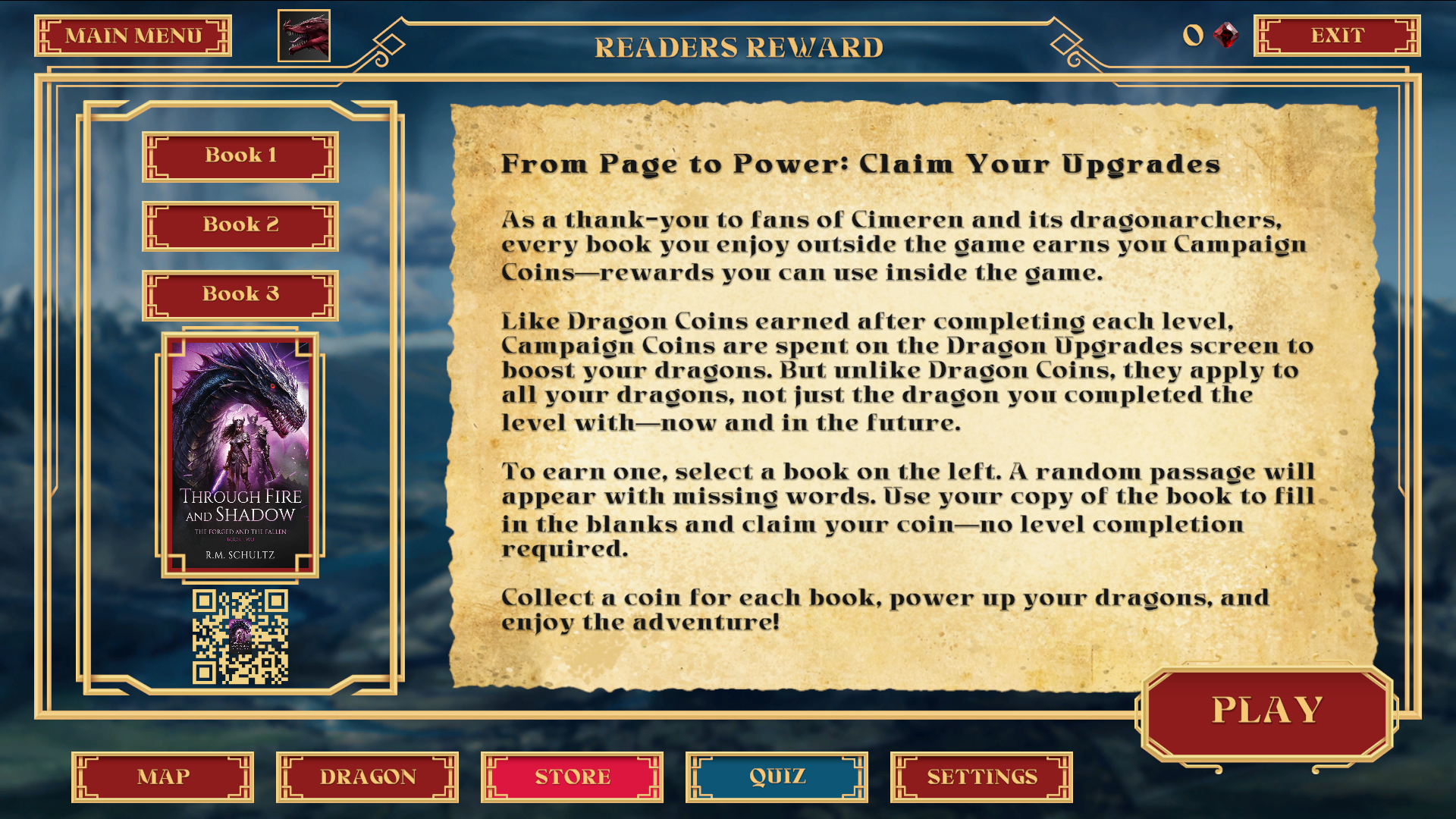
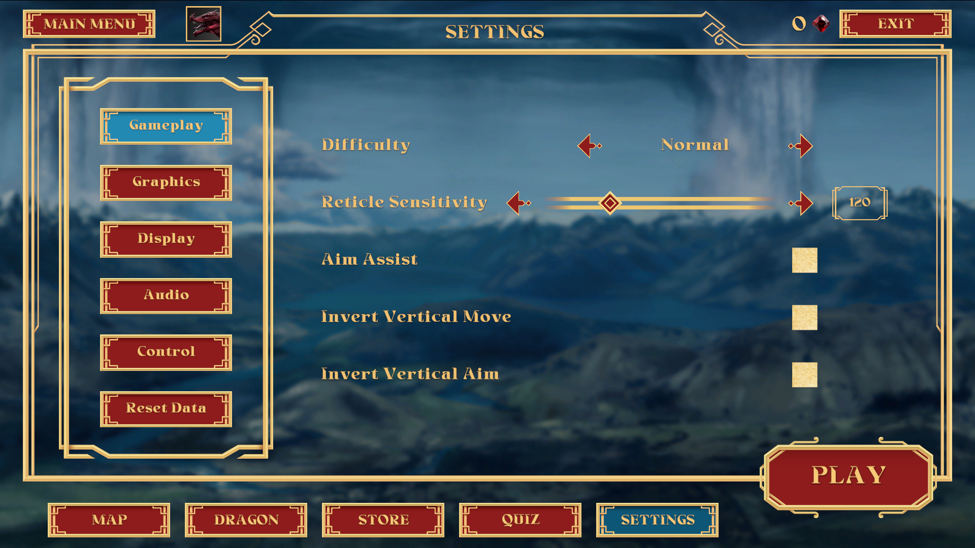
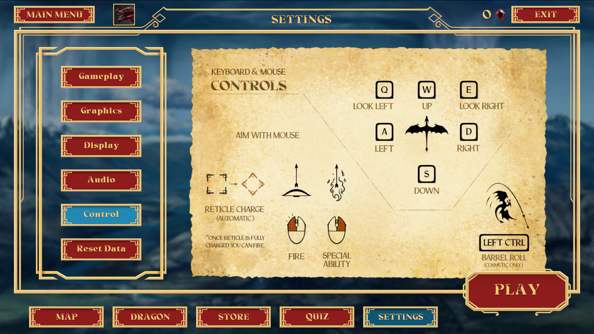
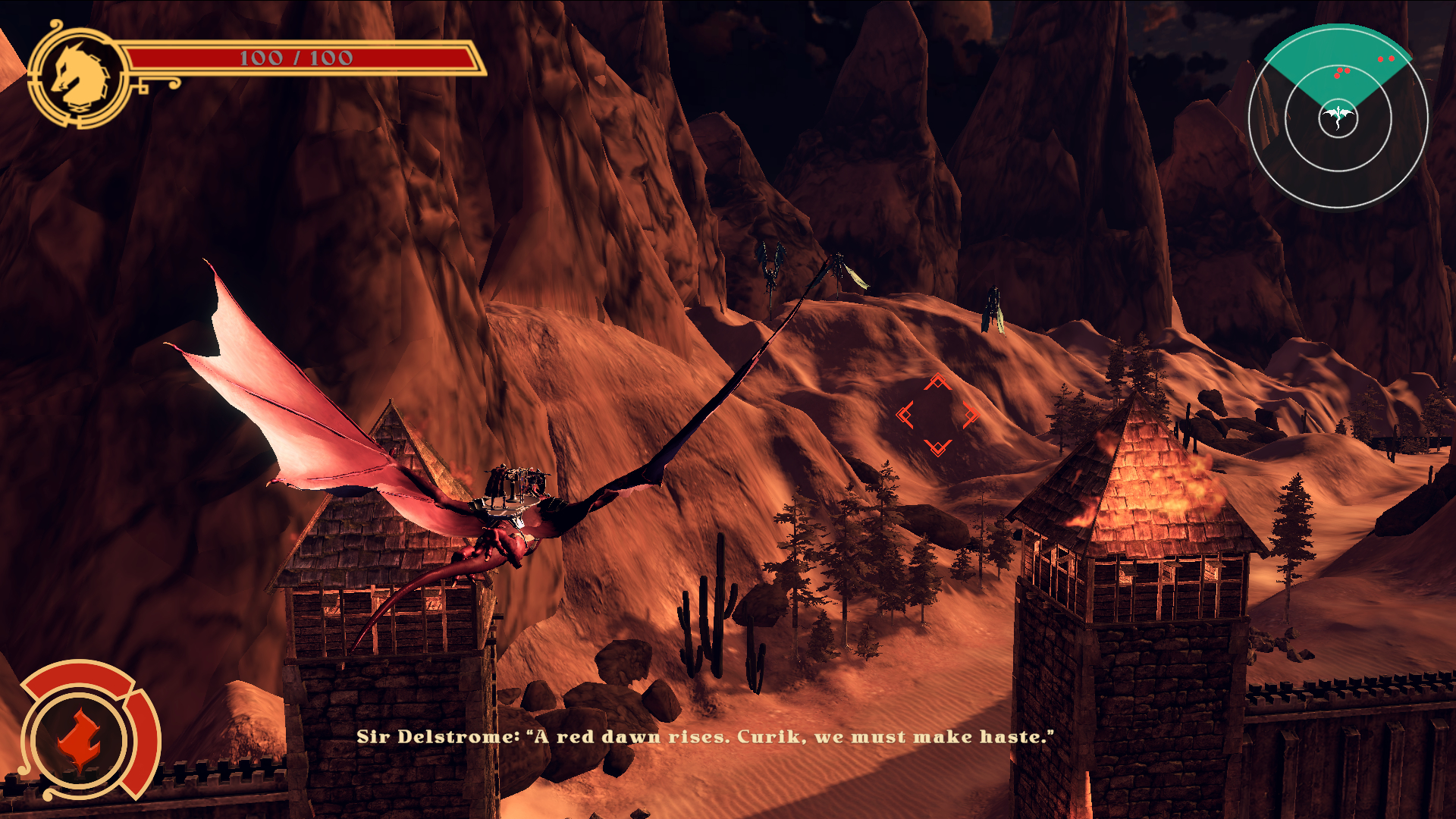
Through Blood And Dragons: Dragon Wars is a third-person, rail shooting action game that puts players in the role of Curik, a young knight in the making, who’s mission is defending the kingdom of Cimerillion as he rides dragons into battle.
ROLE:
UI Designer & 2D Animator
FOCUS:Visual Design & Layout, 2D art/Animation)
TOOLS:Figma, Photoshop, Illustrator, After Effects
DURATION:2 Years
BACKGROUND
Author and client, Ryan M. Schultz wanted to expand his IP from the medium of fantasy novels into the world of video games. He approached Dream Foundry Games with the idea of making a mobile app game based on his prequel novella.
PROBLEM
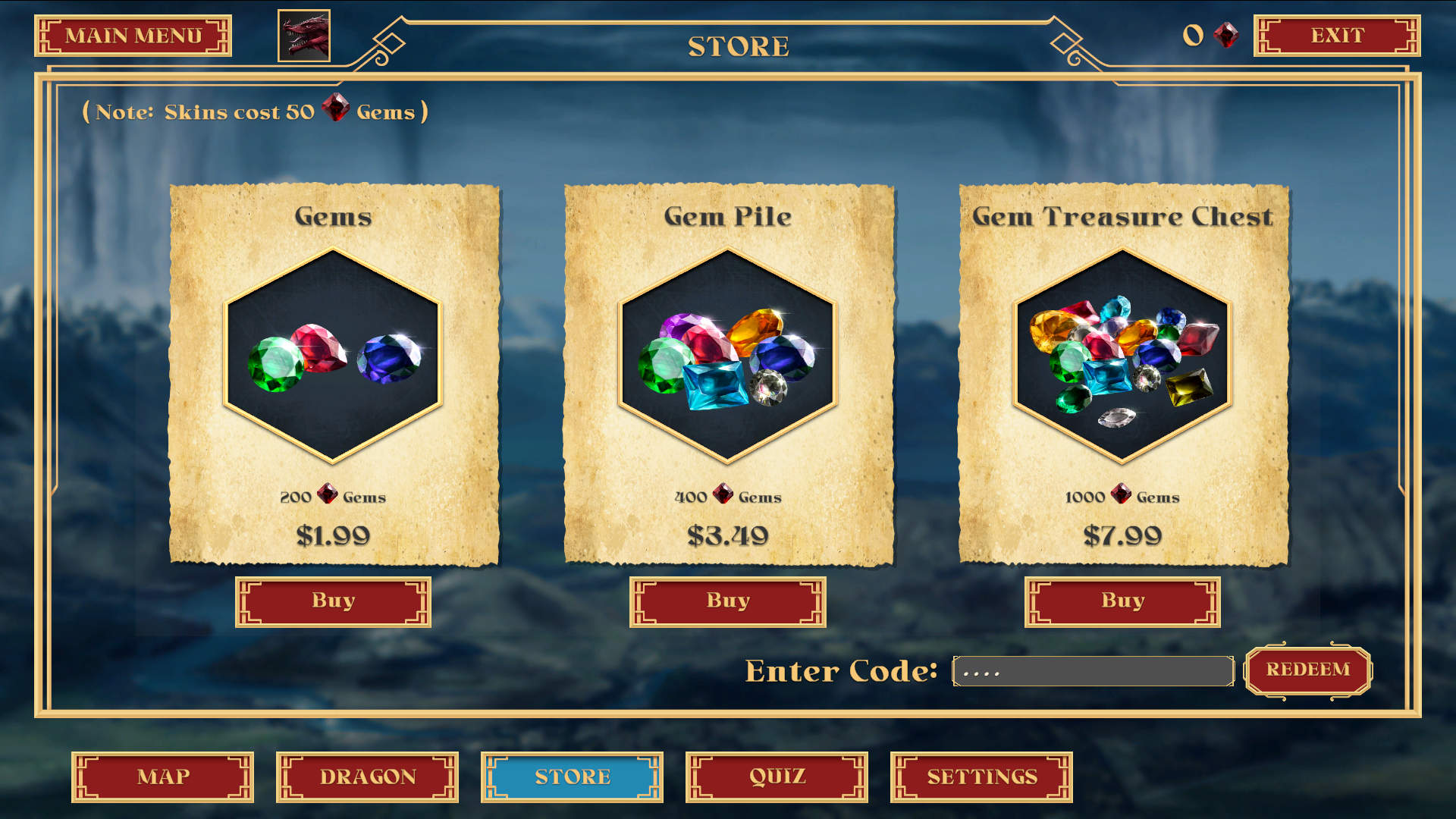
The client wished to create a mobile app game based on his IP that would be fun, unique, and could have monetization without sacrificing games, via “pay to play”, or “pay to win”. He wanted the players to be able to obtain on unlockable features and complete the game without additional purchases, but also wanted to deliver the option to purchase these extra features to players that wanted to go that route. It was also imperative for the art and gameplay to feel unique, and not generic, while adhering to the game genre’s familiar conventions. This was all dictated by a relatively small budget for production. In the end, the client decided to make the game a full release under Steam with the prospect of releasing on the Xbox afterwards.
GOALS
Create a fun, unique gaming experience that stays true to the original source material from the fantasy novel series, while adding novel visualization, and eye pleasing user interfaces with easy navigation.
RESEARCH
OVERVIEW
- CLIENT REVIEW
- VISUAL INSPIRATION
- GENRE ANALYSIS

CLIENT REVIEW
I had been brought on to the project after the initial client review and the first draft of the game design documentation. However, I was able to have time to review these documents that were created by our game designer with approval by the client.
Next, I was able to ask our client a series of questions about the themes of his work, and the visual tones that he wanted to achieve with his game. We discussed the types of iconography that was present in his novels, the demographics of his readers and the age range that the themes in his stories aimed to attract. These discussions gave the team, and myself ideas on how to better translate his IP from a novelization medium to a visual and interactive one. The next step would be to create a mood board for the client and team to better see what this visualization could look like for the project.
VISUAL INSPIRATION
I drew a lot of inspiration from darker themes and more mature fantasy. I wanted to give the world a sense of dread which could make the player feel as though the stakes were high, and that victory at the end of every level would feel even more earned and rewarding.
The first moodboard gave a darker tone to the project ideation. Lots of reds and oranges were juxtaposed against darker background silhouettes. The feeling I was trying to evoke was closer to dark fantasy like Game of Thrones and Berserk.
After review and explanation of my thought process to the team and client, the game developer had suggested a pallet closer related to Lord of the Rings; where the mood felt more fantastic, and the color range was larger, but could still be stacked next to darker shadows to accentuate the vibrance of the color pallet. The result was the final moodboard below.
GENRE ANALYSIS
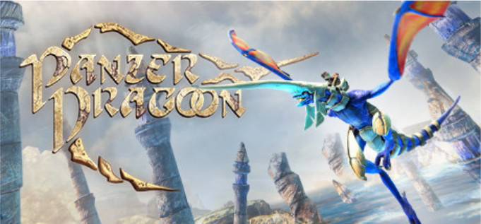
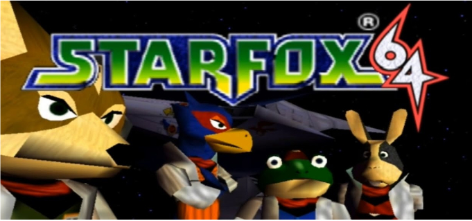
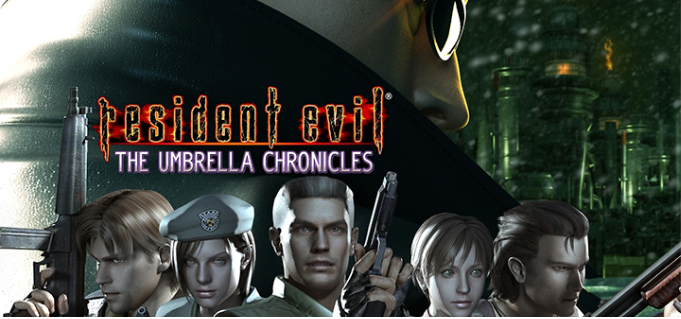
A crucial step in the review and research process was analyzing the rail-shooter genre in video games. This was to best understand the mechanics and the type of visual storytelling that genre excelled at, while learning what could be improved upon when creating the UI and visuals for Through Blood and Dragons.
VISUAL EXPLORATION
OVERVIEW
- USERFLOW ANALYSIS
- COLOR PALETTE
- TYPOGRAPHY
- UI COMPONENTS

USERFLOW ANALYSIS
While the first iteration of the menu flow was conceived by the team’s game designer, the final flow was determined by the team as a whole. This was achieved through team meetings and individual analysis, while also using testing with Milanote.
This was an extremely efficient method as it allowed the team to quicky edit, make notes, and add inner mock-ups to each element for better visualization and representation.
Menu Flow scheme credit to Cameron Bowman
COLOR PALETTE
THROUGH BLOOD AND DRAGONS - UI COLOR PALLETE

TYPOGRAPHY

UI COMPONENTS
UI components for the site include buttons, Icons, and forms. All three use various forms of visual ques which help to create a bridge between the client’s website and the users for ease of navigation and pleasing interactivity. I followed an 8px grid guide for the buttons, scaling for icon hovers, and color swaps for the buttons for quick recognition of interactive behavoirs.
ANIMATED COMPONENT SHOWCASE

INTERFACE DESIGN
OVERVIEW
- INITIAL MOCK-UPS
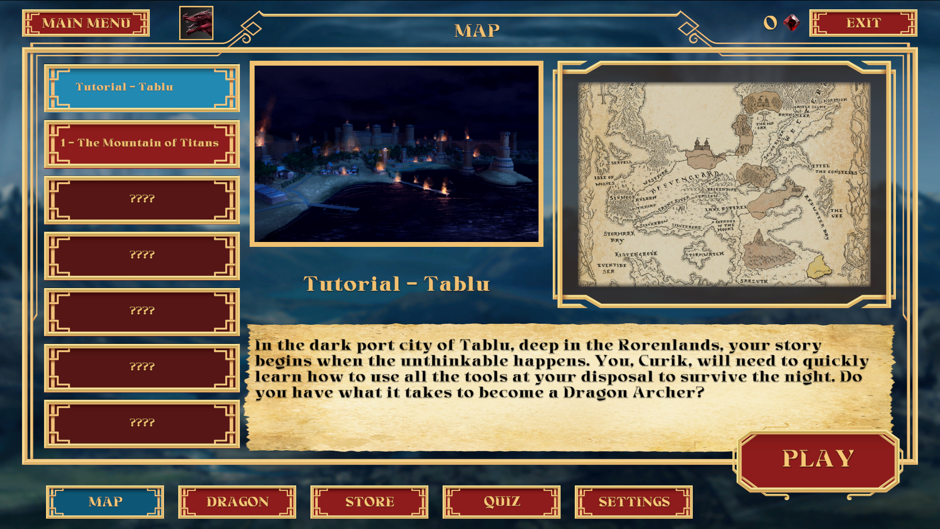
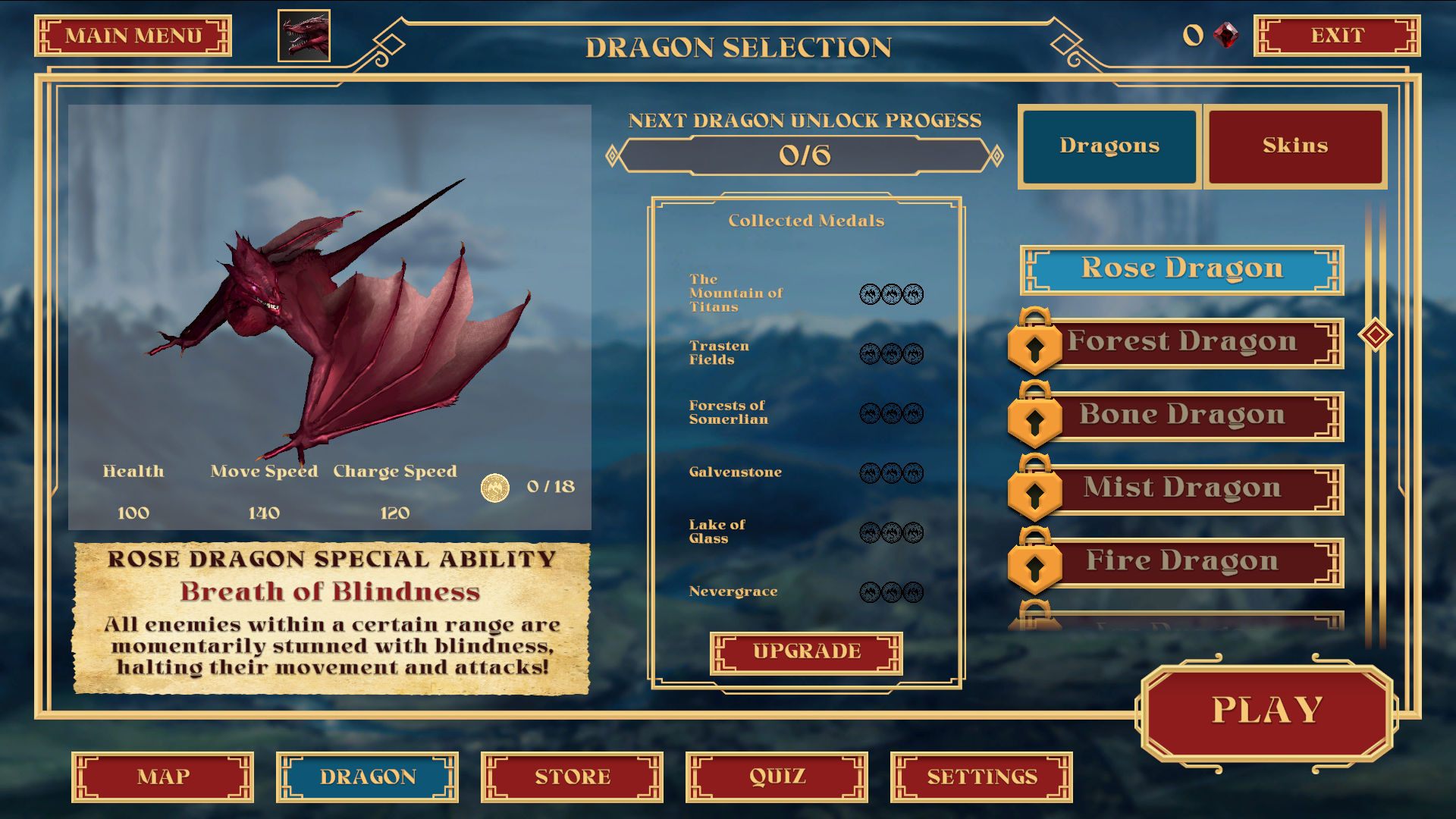
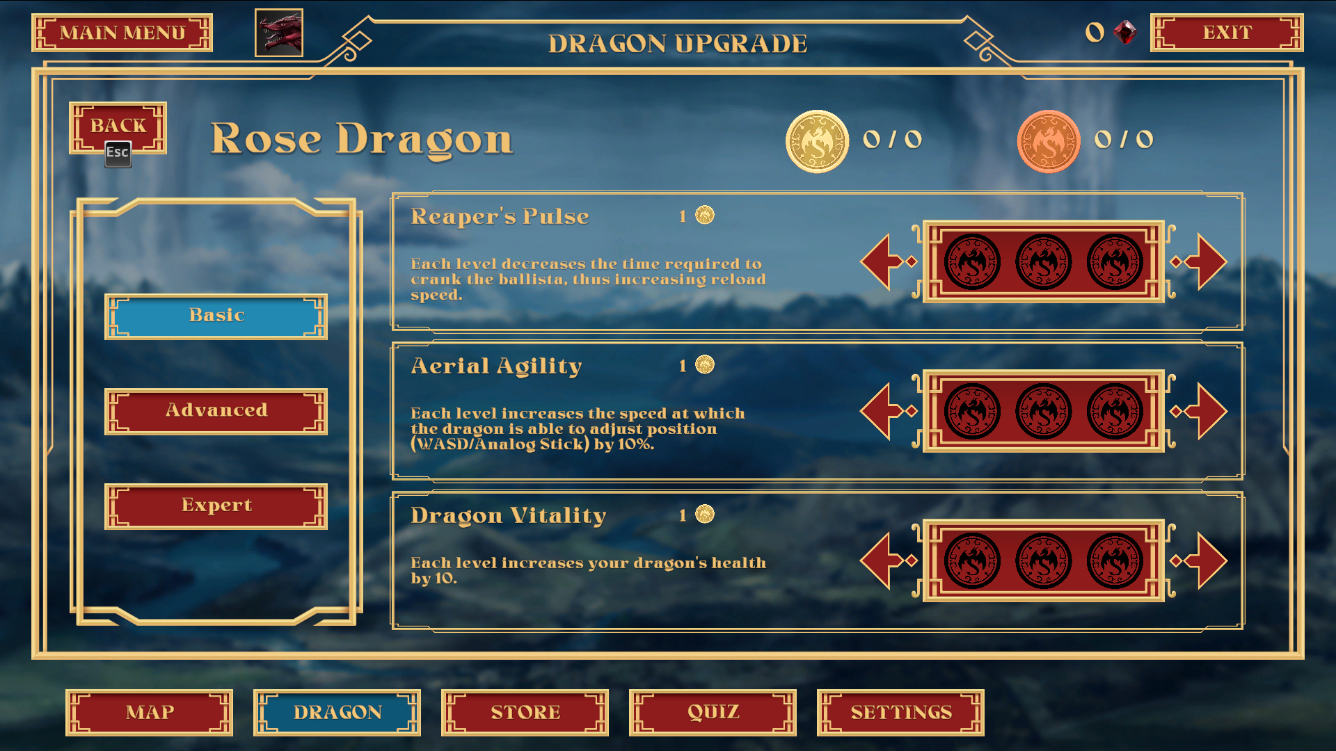
- HIGH FIDELITY DESIGN
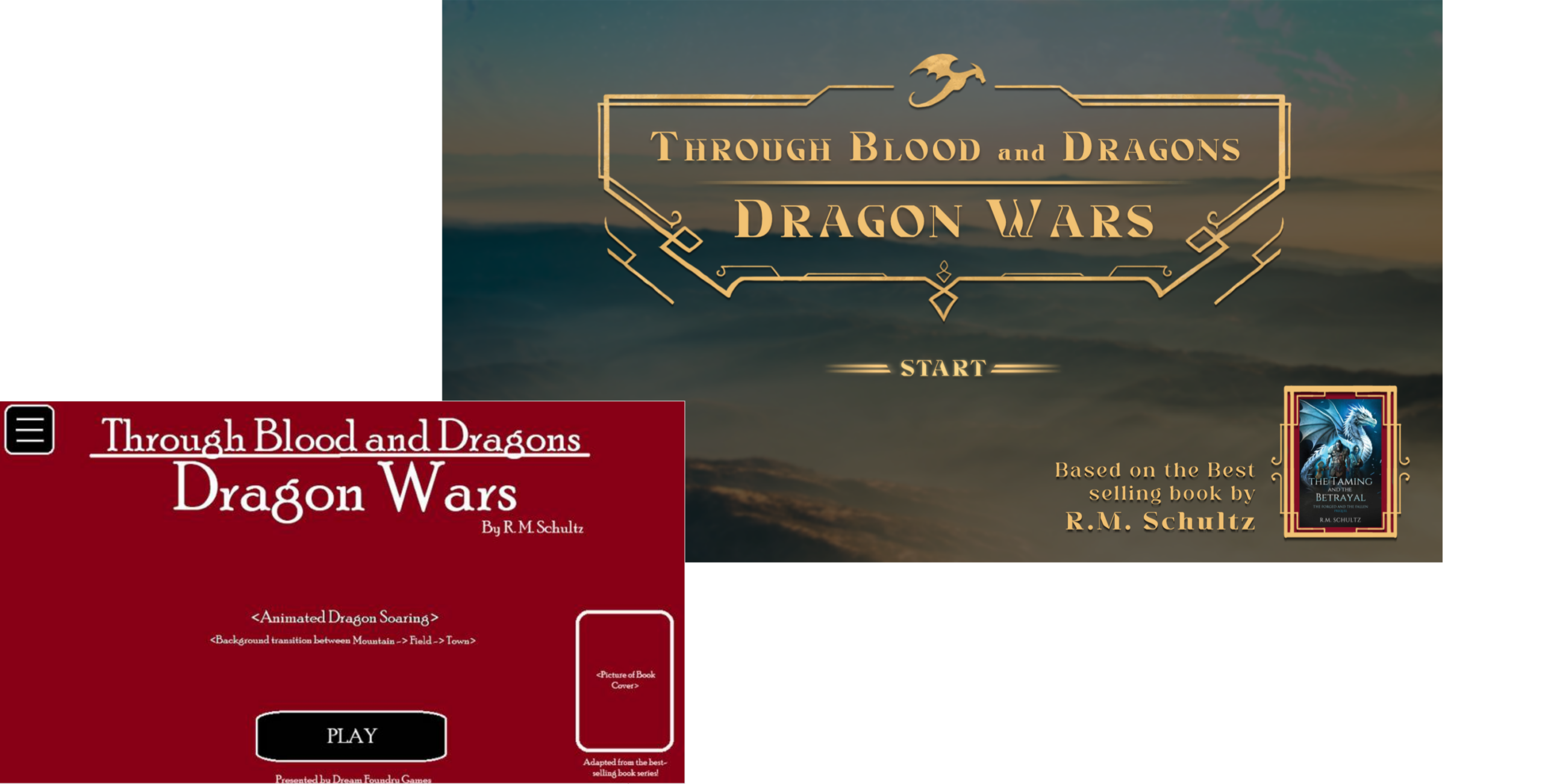
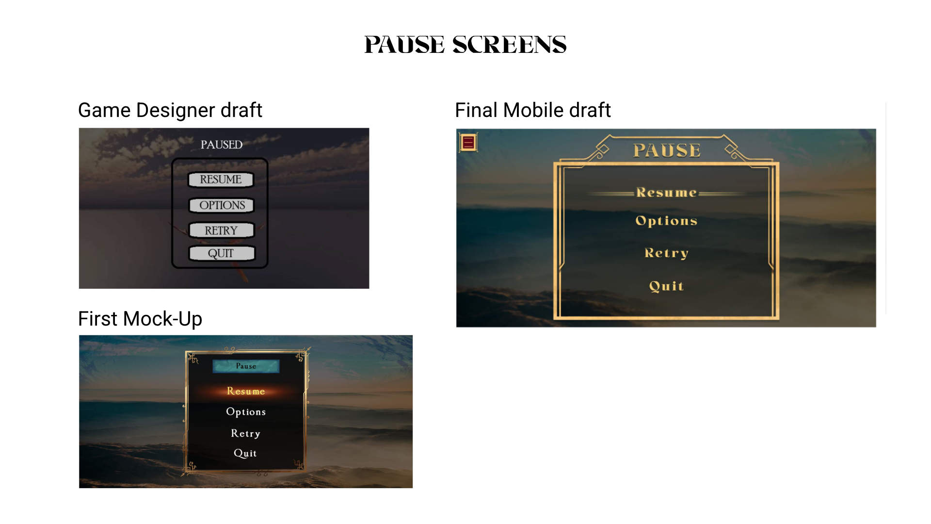
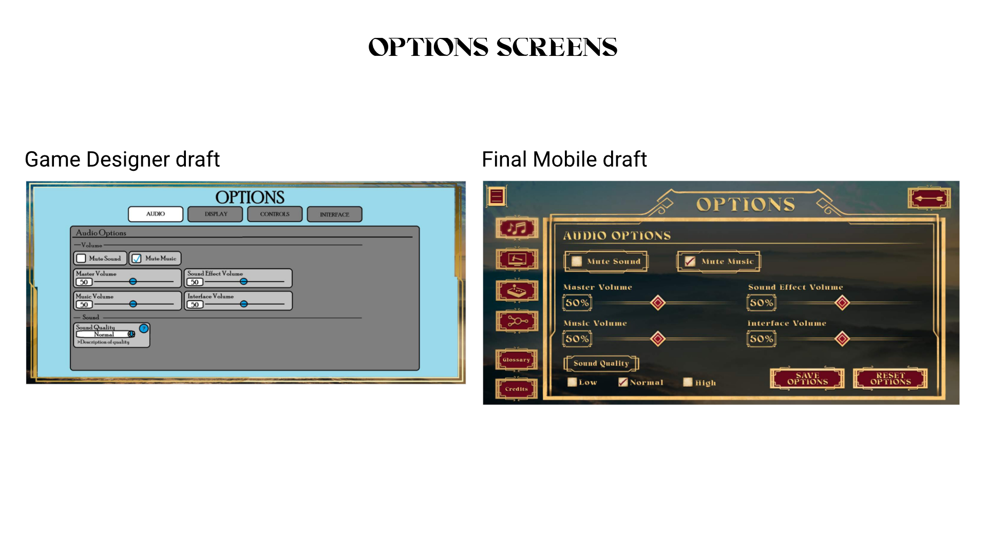
INITIAL MOCK-UPS (created by the game designer)
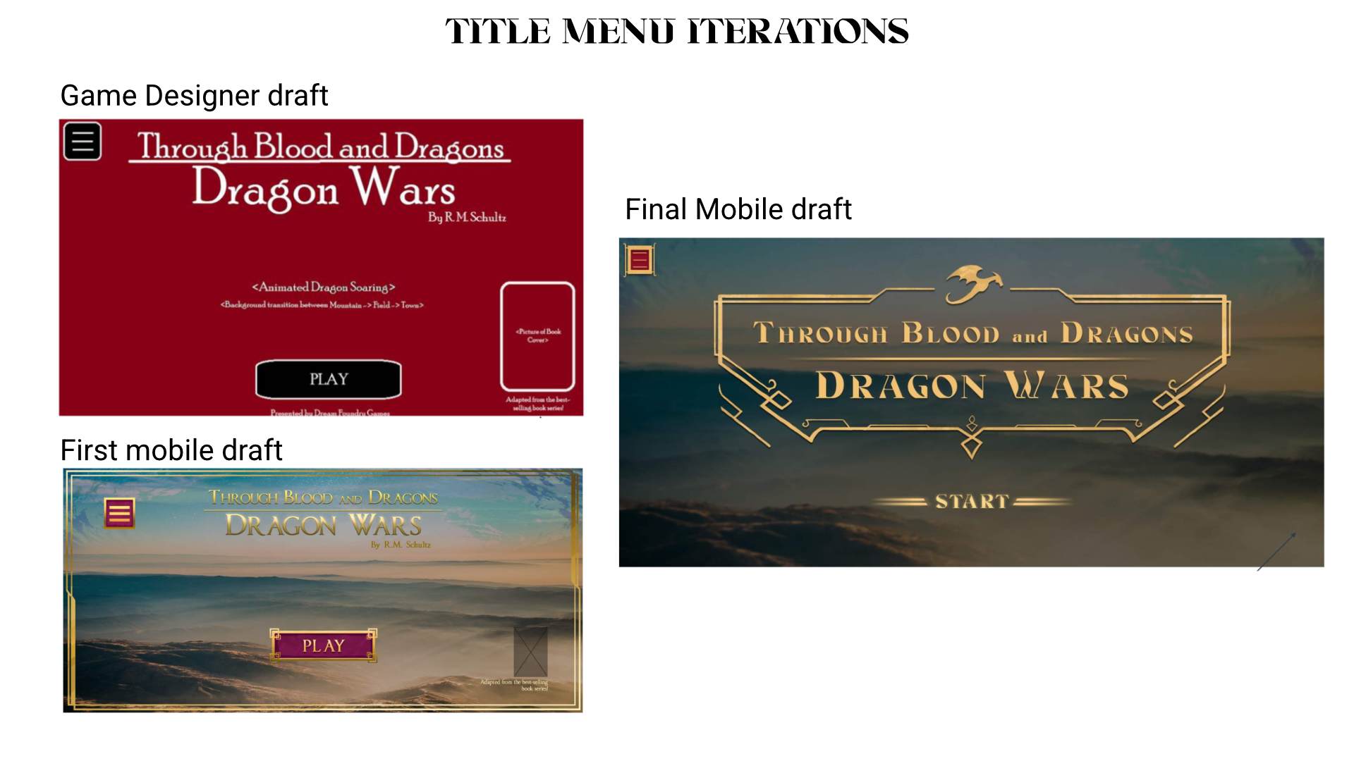
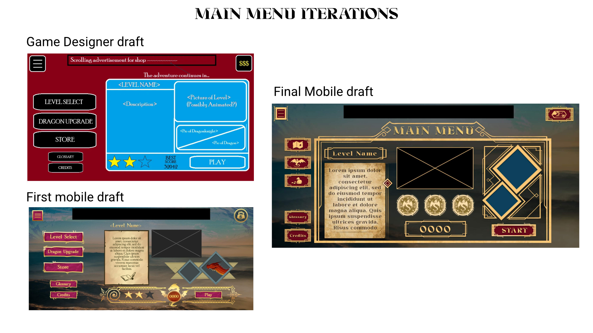
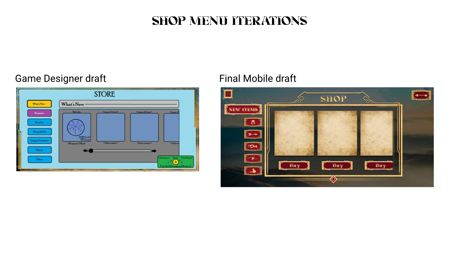
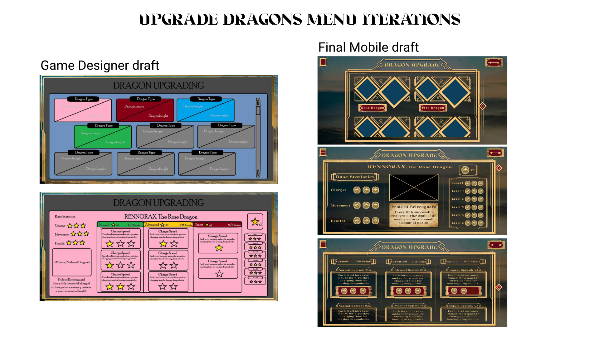
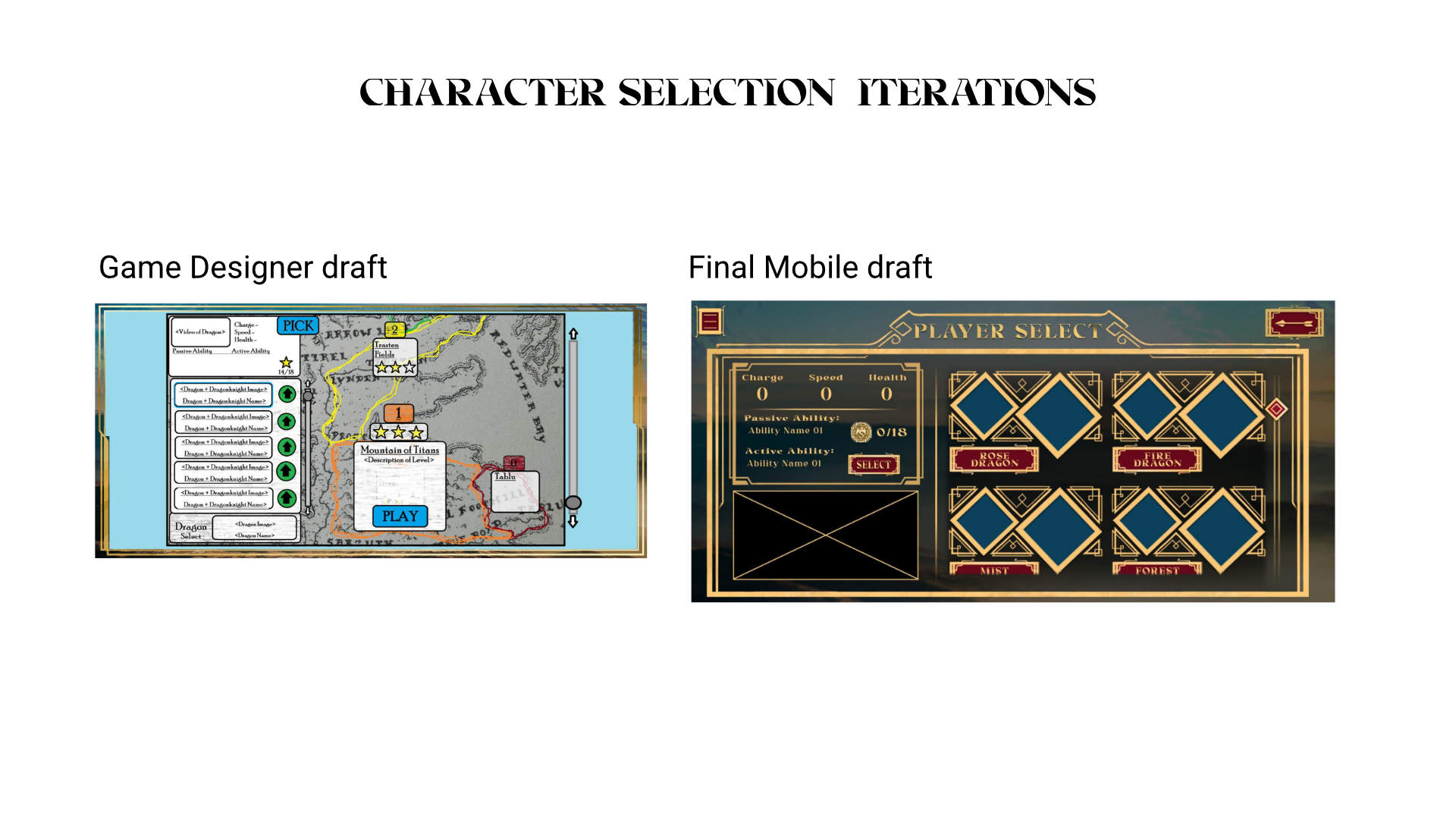
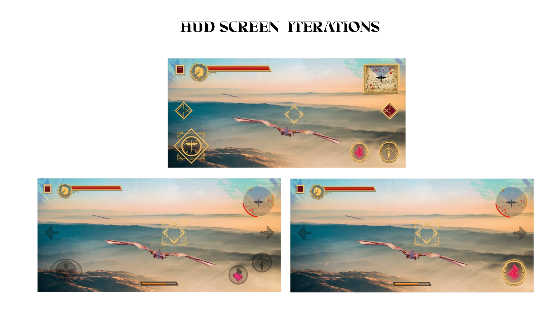
The initial mock-ups and layout were created by our game designer, Cameron Bowman. These were created as a mobile app layout at first, then reworked for platform gaming in mind.
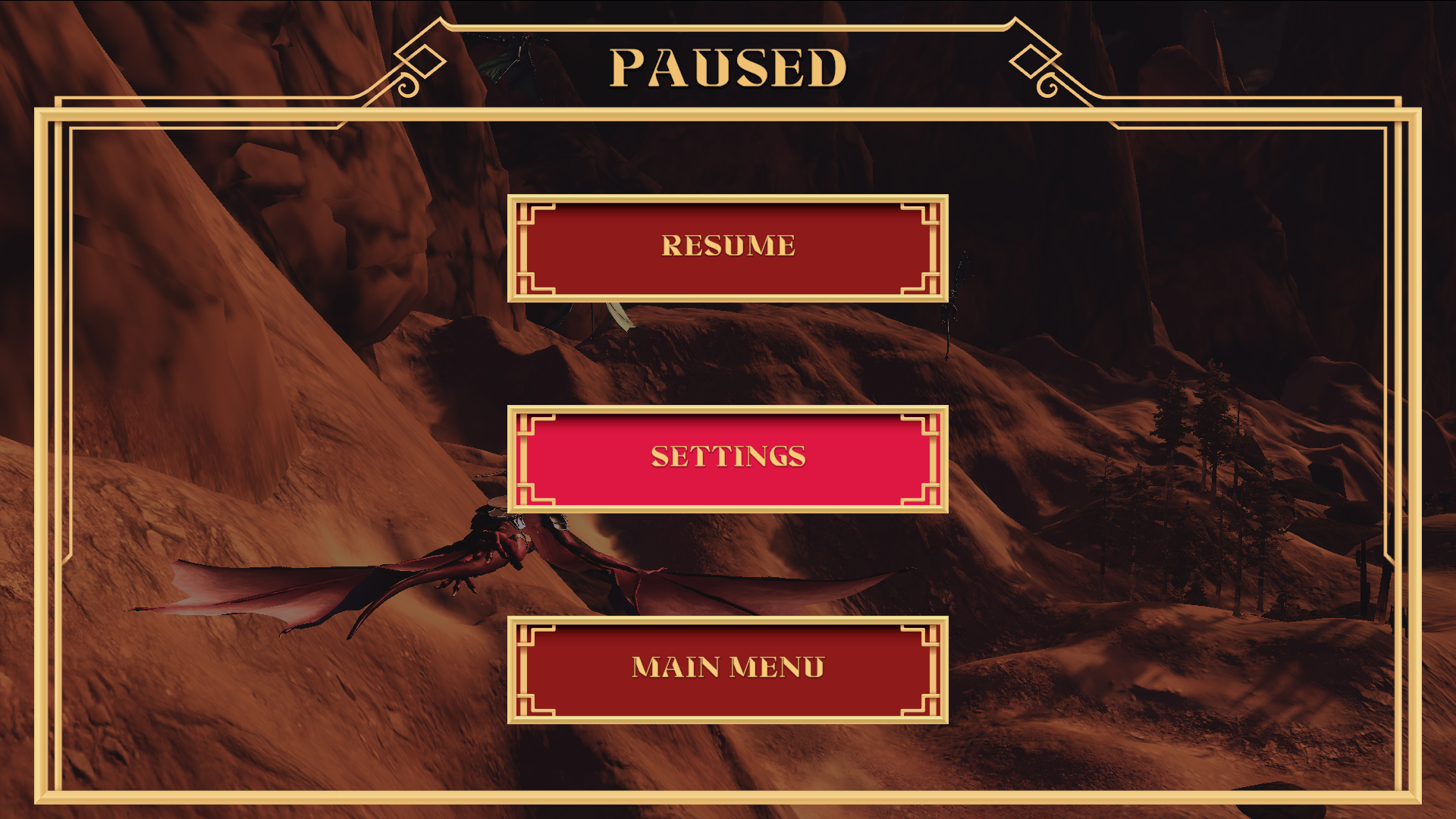
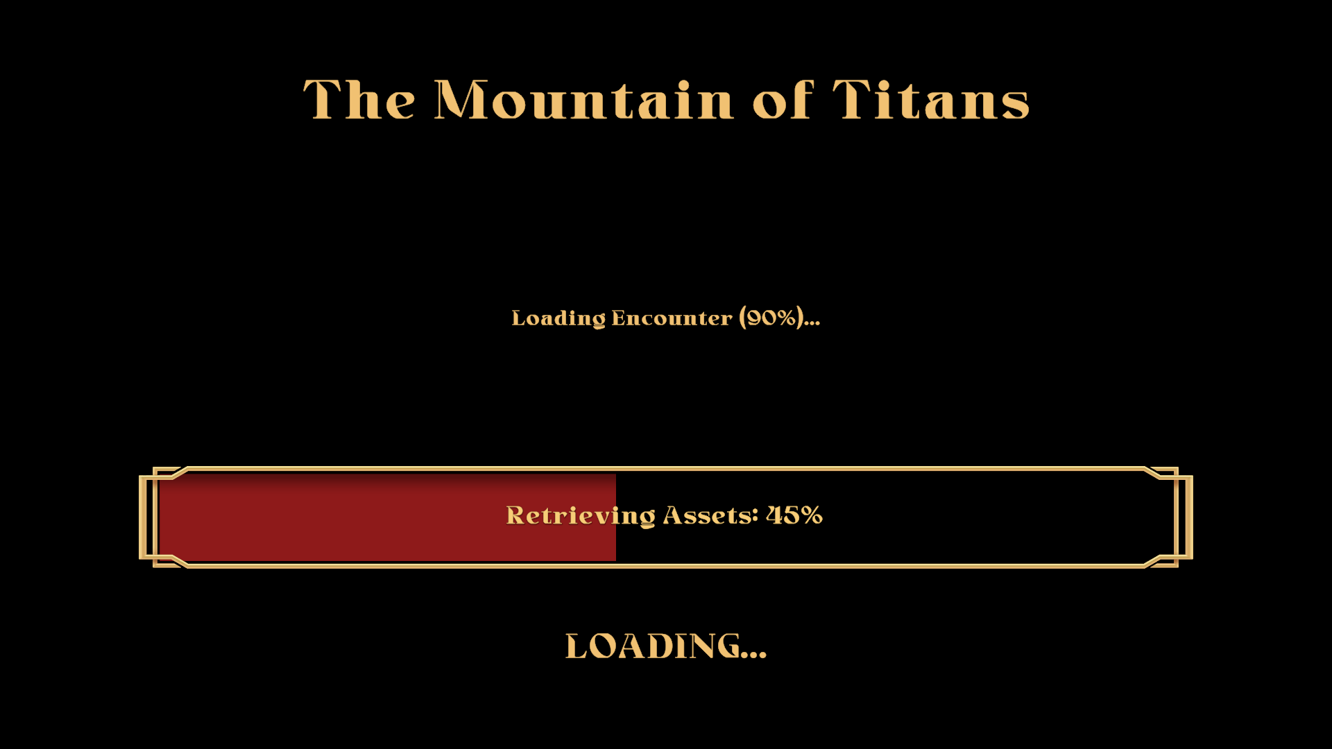
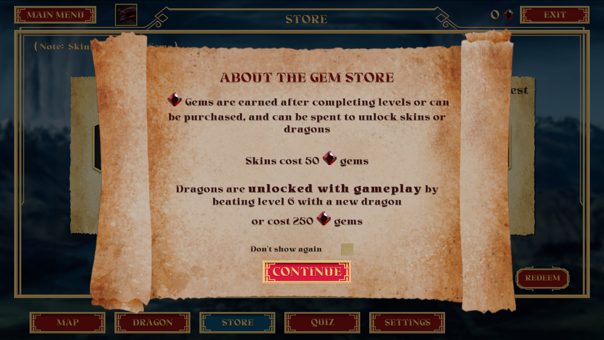
I worked with the game designer to revise these screens to work in a 16:9 aspect ratio (as the game would shift from a mobile to console game) to work with tv’s and and high resolution monitors. The changes in layout were minor, removing items such as a hamburger dropdown, and being able to make better use of the vertical axis for spacing.
HIGH FIDELITY DESIGNS
You can purchase the full game, or play the demo for free at Steam:
REFLECTION
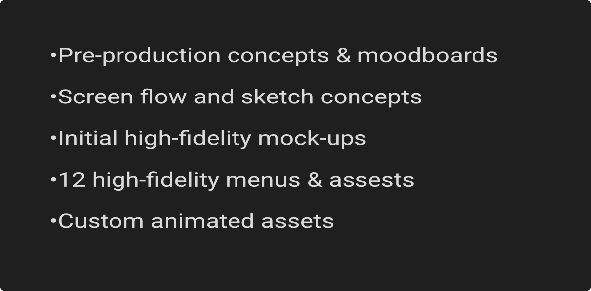
DELIVERABLES SUMMARY
